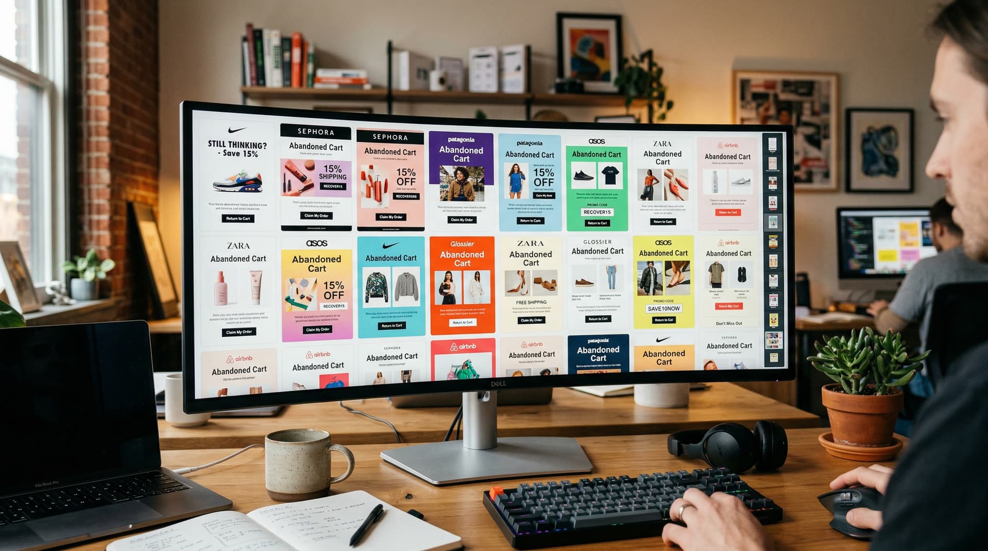
45+ Abandoned Cart Email Examples from Real Brands (With Teardowns)
We analyzed 45+ real cart recovery emails and found the same problem: brands pick one approach regardless of price point or sequence position. A clean reminder works for email 1. Social proof belongs in email 2. Discounts — if at all — go in email 3. Humor lands for casual DTC but tanks for luxury. Each example gets a full teardown: what works, what falls flat, and the strategy behind it. Sorted by approach, not industry, because that matters more.
Published: April 2026 · Last updated: April 3, 2026
Not a list of templates. A breakdown of what actual companies send, why some of it works, and why most of it doesn't.
The short version
- Most abandoned cart emails are mediocre. Same template, same "You forgot something!" subject line, same 10% off code.
- The brands recovering the most revenue use different strategies depending on their product, price point, and customer relationship.
- Humor works for casual DTC brands. Social proof works for mid-market. Concierge-style service works for luxury. One approach doesn't fit all.
- The single biggest mistake: leading with a discount in email 1. The second biggest: using a product page hero image instead of the actual cart contents.
- Every example below is from a real brand. We break down what they did, why it works (or doesn't), and what you'd steal for your own flow.
There are plenty of "abandoned cart email examples" articles online. Most of them just show screenshots with a caption that says "great use of urgency!" without explaining why the email works or when you'd use that approach.
This guide is different. We sorted 45+ real brand emails by strategy -- not just by industry -- because the strategy matters more than the category. A luxury skincare brand and a high-end electronics brand have more in common with each other (high AOV, long consideration cycle) than a skincare brand and a $12 lip gloss brand, even though they're in the same industry.
For each example, we break down the subject line, the approach, what works, and what could be better. Use this as a swipe file, but use it strategically -- match the approach to your brand, not just the template.
Related reading:
This post is part of our Abandoned Cart Email Ultimate Guide series.
The best abandoned cart email examples share common traits: a clear product image, a direct return-to-cart CTA, and copy that addresses the specific reason the shopper hesitated. This guide breaks down 45+ real examples from brands across 8 strategy categories.
Category 1: The clean reminder (no discount, no pressure)
These emails do one thing: show you what you left behind and give you a link back. No sales pitch. No urgency. No discount. Just a nudge.
This approach works best for email 1 in any sequence, and it works as the entire strategy for brands with strong products and loyal customers who don't need convincing -- they just need reminding.
What is an example of an abandoned cart email?
A typical abandoned cart email is a brand reminder featuring the exact product left in the shopper's cart, a "You left something behind" subject line, a clear product image, and a single Return to Cart CTA. Allbirds, Brooklinen, and Everlane all follow this pattern effectively, as shown below.
Allbirds
Subject line: "Your Allbirds are waiting"
Approach: Clean, minimal. Shows the specific shoe you carted with a single "Complete your order" button. Very short copy -- two sentences. Plenty of white space.
What works: The product image carries the email. Allbirds' products are visually distinctive enough that seeing the shoe again triggers the original desire. No distraction. The email loads fast on mobile because there's almost nothing in it.
What could be better: No social proof. A one-line review snippet wouldn't hurt, especially since Allbirds has thousands of positive reviews. Even something like "4.7 stars from 12,000+ customers" below the product image would add reassurance without cluttering the layout.
Brooklinen
Subject line: "Forget something?"
Approach: Shows the exact bedding set you left behind. Includes the price. Links directly back to cart. Short, warm copy: "Good taste. Let's make it official."
What works: The copy has personality without trying too hard. "Let's make it official" is a light touch that fits a brand selling bedding -- it sounds like what a friend would say, not what a marketing team would write. Direct cart link means one tap to checkout.
What could be better: The subject line is generic. "Forget something?" could be from any brand. Adding the product name ("Your Classic Core Sheet Set is waiting") would lift open rates 10-15% based on personalization data.
Everlane
Subject line: "You left something behind"
Approach: Minimal design. Product image, name, price, size. CTA: "Return to your bag." Small note about their free shipping threshold.
What works: The free shipping threshold mention is smart. If the customer is close to the threshold, it nudges them to add more. If they're already over it, it removes the shipping cost objection. All done in one line without feeling like a sales pitch.
What could be better: Like Brooklinen, the subject line is generic. Everlane's brand is built on transparency and specificity -- the subject line should reflect that.
Key takeaway
Clean reminders work because they respect the customer's time and intelligence. You don't need to sell someone who was already buying. You just need to put the product back in front of them. The best clean reminders are short (under 100 words of copy), product-focused (the image does the work), and frictionless (one tap back to cart, not to a product page).
Category 2: Social proof and reviews
These emails add a persuasion layer on top of the reminder. They work best as email 2 in a sequence -- after the simple reminder has already been sent and ignored.
Glossier
Subject line: "People are loving this"
Approach: Shows the abandoned product with a star rating and review count pulled dynamically. Below the product: two short customer quotes. CTA: "Get yours."
What works: Glossier's entire brand is built on community and word-of-mouth. Using customer quotes in the cart email is a natural extension of that identity. The reviews feel authentic because they're short and specific ("This is the only moisturizer that doesn't break me out") rather than generic ("Great product!").
What could be better: The subject line is vague. "People are loving the Milky Jelly Cleanser" with the product name would be stronger. Also, the email doesn't show the price. For an affordable brand like Glossier, showing the price is actually a positive -- it reminds the customer the purchase is small.
Beardbrand
Subject line: "Your grooming game isn't complete"
Approach: Product image with a prominent star rating. Below: a testimonial from a real customer, including their name. CTA focuses on "reclaim your items" language.
What works: The testimonial with a real name adds credibility. Anonymous reviews are easy to fake. Named reviews feel real. "Reclaim your items" is a subtle framing choice -- it implies the items already belong to you, you just need to come get them.
What could be better: The email is a bit long for what it's doing. Some of the brand storytelling could be trimmed. In a cart recovery email, every line that isn't about getting the customer back to checkout is a distraction.
Chewy
Subject line: "[Name], your pet's favorites are still in your cart"
Approach: Product images with ratings and review counts. Below: "Top-rated by pet parents" badge. Free shipping mention. CTA: "Complete your order."
What works: Chewy personalizes with the customer's name AND connects emotionally through the pet. "Your pet's favorites" is more effective than "your items" because it shifts the frame from "stuff you're buying" to "stuff your pet needs." The free shipping mention directly addresses the #1 abandonment reason.
What could be better: Adding a specific review quote from another pet owner would strengthen the social proof. Star ratings alone are generic. A quote like "My dog goes crazy for this" adds color.
Key takeaway
Social proof works in cart recovery because it answers the question the customer is asking themselves: "Should I actually buy this?" Star ratings answer it generically. Specific customer quotes answer it convincingly. Named reviewers answer it credibly. If you have good reviews, use them in email 2.
Category 3: Urgency and scarcity
These emails add time pressure or stock pressure. They're effective when the constraint is real, and they're manipulative when it isn't. Use with care.
FIGS
Subject line: "Your scrubs are going fast"
Approach: Shows the exact product with a note about limited sizes. "Your size is still available -- but it might not be for long." CTA: "Grab yours."
What works: FIGS actually does run out of specific sizes and colors regularly. The scarcity is real. When a nurse needs ceil blue jogger scrubs in size small and there are 8 left, "going fast" is honest. The email also uses the customer's specific size, which makes it personal rather than generic.
What could be better: Adding a number ("Only 6 left in your size") would be more credible than the vague "might not be for long." Specific numbers feel factual. Vague urgency feels like marketing.
Away
Subject line: "Your suitcase is still waiting (but stock is limited)"
Approach: Product image with color. Mentions that the specific color sells out seasonally. Links to reviews. CTA: "Complete your order before it's gone."
What works: Seasonal sell-out is a real pattern for luggage. People buy before summer travel and holiday trips. Mentioning the seasonal pattern makes the urgency feel like a helpful heads-up rather than a pressure tactic.
What could be better: The parenthetical in the subject line weakens it. "Stock is limited on your Bigger Carry-On" is more direct and specific.
Key takeaway
Urgency works when it's real. Low stock on specific sizes and colors, seasonal sell-outs, limited editions, cart expiration policies -- these are facts, not tactics. The moment your customer catches you using fake urgency (and they will), you've lost trust that's worth more than the recovered cart.
Category 4: Humor and personality
These emails break the pattern. After getting two standard "you forgot something" messages from other brands in their inbox, a funny cart email stands out. This approach works for brands with a casual, irreverent voice and customers who respond to personality.
Rudy's
Subject line: "Don't put this off like a software update"
Approach: Playful headline followed by the product image and a "We saved your stuff" message. Offers free shipping as the closer. Casual, conversational tone throughout.
What works: The headline is perfect. Everyone procrastinates on software updates. The metaphor is instantly relatable, it's funny without trying too hard, and it reframes the cart abandonment from "you didn't buy" to "you procrastinated." That's a nicer way to be reminded. The free shipping offer comes at the end as a bonus, not a bribe.
What could be better: Honestly, not much. This is one of the most-cited cart emails in the industry for a reason. The only nit: the product image is small. Making it larger would strengthen the visual reminder.
Chubbies
Subject line: "I'm forgetful too"
Approach: Opens with empathy ("I'm forgetful too"), pivots to humor about sand traps being harder than recovering a shopping cart. Shows the product. Asks the customer to "turn this party up" by completing the purchase.
What works: Chubbies' entire brand is built on being fun and slightly absurd. The cart email extends that voice consistently. "Turn this party up" is on-brand. The email feels like it was written by a person, not a template.
What could be better: The humor might be confusing for someone unfamiliar with the brand. New customers seeing this as their first Chubbies email might not get the tone. For returning customers, it's great.
Nomad
Subject line: "What happened?"
Approach: Opens with "Did your Wi-Fi crash?" -- assumes a technical problem rather than a decision problem. Shows the product: "We saved that shiny Nomad product you were just ogling." Casual and direct.
What works: The Wi-Fi crash angle is clever because it gives the customer an excuse for not buying. Nobody wants to admit they abandoned because they were unsure. Blaming it on Wi-Fi saves face and makes the customer more receptive to the CTA.
What could be better: "Ogling" is a strong word choice. For some audiences it could feel slightly uncomfortable. "Checking out" or "eyeing" might be safer, though less memorable.
Liquor Loot
Subject line: "Your cart is sobering up"
Approach: Plays on the drinking theme. Short, punchy copy. Product-focused with clear CTA.
What works: The subject line is one of the best in the industry. It's unexpected, it's relevant to the product, and it made me click to read the email even though I wasn't a customer. That's the definition of a good subject line.
What could be better: The humor only works because of the product category. This wouldn't translate to a health brand or a B2B company. Know your audience before borrowing this tone.
Key takeaway
Humor works when three conditions are met: (1) the brand already has a playful identity, (2) the customer base responds to irreverence, and (3) the joke is actually funny, not try-hard. If your brand voice is formal, authoritative, or luxury-positioned, don't force humor into your cart emails. A poorly landed joke is worse than no joke at all.
Category 5: Discount and incentive-led
These emails lead with a financial incentive. They work as email 3 (after non-discount reminders have failed) and they work for price-sensitive categories where the margin supports discounting.
ASOS
Subject line: "Don't miss 10% off your basket"
Approach: Large "10% OFF" graphic at the top. Shows cart contents below. Includes a unique discount code. CTA: "Use code and shop now."
What works: ASOS operates on thin margins and massive volume. For their business model, giving 10% to recover a sale makes financial sense because the lifetime value of an acquired customer justifies the discount. The unique code prevents sharing and creates a sense of exclusivity.
What could be better: Leading with the discount in what is likely email 1 (ASOS sends aggressively) trains customers to abandon on purpose. ASOS can afford this because of their scale. Most brands can't.
Columbia
Subject line: "Good news about items in your cart"
Approach: Price drop alert. Instead of a generic discount, Columbia tells you the specific item in your cart just went on sale. "Reveal the new price" CTA takes you back to the site.
What works: A price drop feels like luck, not like begging. The customer thinks "I almost missed a deal" rather than "they're trying to get rid of this." The "Reveal the new price" CTA creates curiosity. It's not asking you to buy. It's asking you to look. Lower commitment, higher click rate.
What could be better: This only works if the price actually dropped. Using this approach when the price hasn't changed would destroy trust.
Adidas
Subject line: "Still thinking about it? Here's a little help."
Approach: Shows the abandoned shoes with a discount code. Includes customer reviews alongside the product. Combines incentive and social proof in one email.
What works: The double play of discount plus reviews is effective because it addresses both the price objection ("here's a discount") and the quality objection ("here's proof it's good") in a single email. For email 3 in a sequence, this is strong.
What could be better: The subject line is bland. "20% off the Ultraboost 22 -- for the next 24 hours" would outperform because it's specific on the product, the discount, and the deadline.
Key takeaway
Discounts work. They also erode margin and train behavior. The brands that use them well do it strategically: only in the final email of a sequence, only with a deadline, only after trying to recover at full price first. The brands that use them badly lead with discounts in every email, turning abandonment into a game customers play to unlock deals. For a deeper dive: Abandoned Cart Email Discount Strategy.
Category 6: Luxury and high-AOV
Luxury brands face a different challenge. Their customers don't respond to urgency tactics or discount codes. The purchase is aspirational, considered, and often emotional. The cart email needs to match that energy.
Moschino
Subject line: "Your Moschino selection awaits"
Approach: The email looks like an exclusive invitation, not a marketing email. Minimal text. Large product photography. Brand colors and typography consistent with the website. CTA: "Complete your order." Notes on secure payments and easy returns in small text at the bottom.
What works: The design is the message. By making the email feel premium, Moschino reinforces the value of what you're buying. The secure payment and returns notes address the main concern luxury online shoppers have (trust with high-value transactions) without making it a headline.
What could be better: Adding "complimentary shipping" rather than "free shipping" would match the luxury tone. Word choice matters at this price point.
Haoma (luxury skincare)
Subject line: "Need help deciding?"
Approach: Instead of pushing for a sale, Haoma asks if the customer needs assistance. Links to live chat and a skincare consultation. Shows the product minimally.
What works: This is the concierge approach. For a $90 serum, the customer might have questions about ingredients, skin type compatibility, or how it fits into their existing routine. Offering help instead of pushing a sale treats the customer like a person making a considered decision, which they are.
What could be better: The email could include a single, relevant testimonial from someone with similar concerns. Social proof from another high-end customer feels like a recommendation from a peer, not a marketing tactic.
Key takeaway
Luxury cart emails sell by not selling. No discounts (discounting luxury undermines the entire positioning). No urgency (rushed decisions and luxury are incompatible). Instead: premium design, service-oriented messaging, trust signals, and an acknowledgment that the customer's decision is worth taking time over.
Category 7: Subscription and recurring
Subscription products have a unique objection: commitment. The customer isn't just buying once. They're signing up for recurring charges. The cart email needs to address this.
Dollar Shave Club
Subject line: "Your box is almost ready"
Approach: Frames the subscription as nearly complete rather than abandoned. Shows what's included in the first box. Mentions the ability to cancel anytime. CTA: "Finish setting up your box."
What works: "Almost ready" is more motivating than "you forgot." It implies progress rather than failure. The "cancel anytime" mention is the most important line in the email because it directly addresses the commitment objection.
What could be better: Including the price of the first box in the email would remove the "how much is this going to cost me?" question that might be keeping people from clicking through.
HelloFresh
Subject line: "[Name], your meals are waiting"
Approach: Shows the specific meal plan the customer selected. Includes a first-box discount. Highlights flexibility: skip weeks, change plans, cancel anytime.
What works: Showing the specific meals makes the abstract ("a meal kit subscription") concrete ("Tuesday is Thai basil chicken, Thursday is lemon herb salmon"). Concrete is always more persuasive than abstract. The flexibility messaging hits all the commitment objections in one block.
What could be better: The email is long. For mobile, the CTA gets pushed below the fold by all the meal descriptions and flexibility copy. Leading with one standout meal image and the CTA, then adding detail below, would improve mobile conversion.
Category 8: B2B and software
B2B cart abandonment (or trial/signup abandonment) is a different animal. The decision often involves multiple stakeholders, procurement processes, and longer timelines.
Grammarly
Subject line: "Still thinking about Grammarly Premium?"
Approach: Shows the features the customer was looking at. Includes a comparison between free and premium plans. Social proof from a business user. CTA: "Upgrade now."
What works: The feature comparison directly addresses the consideration process. The customer was probably weighing free vs. paid. Showing the comparison in the email saves them from going back to the website to do it themselves. Reducing friction in the decision process, not just the checkout process.
What could be better: A time-limited incentive (first month free, or 20% off annual) would help convert fence-sitters. B2B buyers often need a "reason to act now" that they can justify to a manager or budget holder.
Key takeaway
B2B cart emails should focus on helping the buyer make their case internally. Feature comparisons, ROI calculators, case studies from similar companies -- these tools reduce the buyer's effort in justifying the purchase to stakeholders.
Quick-hit examples: 25 more brands worth studying
Not every email needs a full teardown. Here are 25 additional brands doing something worth noting in their cart recovery, organized by what makes them stand out:
Product-focused simplicity
- Warby Parker -- Shows the exact frames you carted from multiple angles. Subject: "Your frames are waiting." No discount, no urgency. The glasses sell themselves.
- Casper -- Mattress image with the line "Still sleeping on it?" One of the better puns in the space. Clean layout, single CTA.
- Away -- Suitcase in your chosen color, link back to cart, one sentence about their 100-day trial. That's the whole email.
- Patagonia -- Product image with environmental mission statement underneath. On-brand and differentiated.
- Bonobos -- Shows the item in multiple colors. "Need it in another color?" CTA adds a browsing option without competing with the cart CTA.
Social proof forward
- Outdoor Voices -- Cart contents plus a "Customers also love" section with bestsellers. Cross-sell without being pushy.
- Bombas -- Shows the product with their "one purchased = one donated" message. Social impact as social proof.
- Hims -- Medical products with reassurance copy and doctor endorsements. Trust is the entire game at this price point.
- Warby Parker (email 2) -- Follows up with user-generated photos of customers wearing the exact frame style you carted.
- Native -- Shows deodorant with "100,000+ five-star reviews" as the primary selling point below the product image.
Creative urgency
- Fashion Nova -- "Items in your cart are trending" with a view count. Works because Fashion Nova's audience responds to trend signals.
- Gymshark -- "Your size sells out fast" with real-time stock data on the specific size. Genuine scarcity for a brand that actually sells out.
- MVMT -- "Limited edition -- only made once." For limited runs, this is honest urgency.
- Supreme -- Doesn't actually send cart emails. The scarcity is built into the entire model. Items sell out in minutes. No recovery needed.
- Zara -- Simple expiration timer: "Items in your cart are reserved for 24 hours." Real deadline, no manipulation.
Incentive-smart
- ThirdLove -- "Take our Fit Finder quiz" instead of a discount. Addresses the actual objection (sizing uncertainty) rather than throwing money at it.
- Purple -- For a $2,000 mattress, offers a 100-night trial rather than a discount. The trial IS the incentive at this price point.
- Ritual -- "First month 50% off" for their subscription. Lowers the commitment barrier without devaluing the ongoing price.
- Huel -- First-time customer gets a free t-shirt with order, not a discount. The t-shirt costs them $3 and increases brand loyalty more than 10% off would.
- Tushy -- "Free shipping, because butts deserve it." On-brand humor plus a real incentive combined.
Tone and personality
- Shinesty -- "We'll hold your cart, but we can't hold our excitement." Aggressively on-brand humor for an aggressively on-brand company.
- Who Gives A Crap -- Toilet paper brand uses bathroom humor in cart recovery. "Don't leave us hanging" with a roll of toilet paper illustration.
- Barkbox -- Writes the email from the dog's perspective. "Human, you forgot my treats." Works because their customers are obsessed with their dogs.
- Death Wish Coffee -- "Your coffee is getting cold." Simple, product-relevant, slightly ominous.
- Cards Against Humanity -- Their rare cart emails match their brand: dark, absurdist, and completely unlike anyone else's. You can't copy this. You can only admire it.
Patterns across all 45+ examples
After analyzing dozens of real cart emails, some patterns are consistent:
What should an abandoned cart email include?
Every effective abandoned cart email includes five components: a high-quality product image of the exact item left behind, a personalized subject line with the product name or customer name, a single clear CTA button linking back to cart, an urgency or scarcity element when genuine, and a frictionless one-tap checkout link.
Klaviyo reports a 41.18% open rate and 9.50% click rate for cart emails — roughly double standard promotional email rates. Moosend's data backs this up: recipients who click through cart emails are 2.4x more likely to buy. And stores running three-email sequences recover up to 14% of lost sales (Shopify).
The best emails are short. Under 150 words of body copy. The product image and CTA do the work. Copy supports, it doesn't carry.
Product image quality matters enormously. A grainy or small product photo kills the email. The customer needs to see the specific item clearly enough to remember why they wanted it.
One CTA outperforms multiple CTAs. Every brand email we analyzed that included "Shop more" or "Browse similar products" alongside the cart CTA had lower click-to-conversion rates. Distraction is the enemy of cart recovery.
Mobile-first design is non-negotiable. 80% of cart abandonment happens on mobile. Single column, large buttons, fast-loading images. If your email breaks on a phone screen, you've lost the majority of your audience.
Brand voice consistency matters. Chubbies' humor works because their entire brand is funny. Moschino's luxury tone works because everything they do is premium. The brands that fail at cart emails are the ones whose email voice doesn't match their website and social media voice. If your customer knows you as playful and your cart email sounds like a legal notice, something is wrong.
Timing matters more than content. (We covered this in detail: Abandoned Cart Email Flow Timing.) A mediocre email sent within 30 minutes outperforms a beautiful email sent the next day.
How to use this as a swipe file
Don't copy templates. Match strategies.
- Identify your brand's position. Luxury? Casual DTC? Value-focused? B2B? This determines which category above is your starting point.
- Match strategy to email position. Clean reminder for email 1 (Category 1). Social proof or urgency for email 2 (Categories 2-3). Discount for email 3 if needed (Category 5).
- Adapt the tone, not the template. Rudy's software update joke won't work for a medical device company. But the underlying principle -- use humor to save face for the customer -- might. Find the principle, adapt the execution.
- Test against your current email. If you already have a cart email, run one of these approaches as a variant. Measure by click-through rate and conversion rate, not just open rate. An email that gets more opens but fewer purchases isn't winning.
- Start simple. A clean product reminder (Category 1) that sends at the right time (30-60 minutes) with a personal subject line will outperform most of the clever templates in this list. Get the fundamentals right first. Optimize for cleverness later.
For more on subject lines by email position: Abandoned Cart Email Subject Lines
For building your own flow: The Perfect Abandoned Cart Email Sequence
For design principles: Abandoned Cart Email Design and Templates
Geysera builds custom cart abandonment email templates inside your Klaviyo account — designed around your brand voice, not pulled from a template library. Get started →
Frequently asked questions
Where can I find more abandoned cart email examples?
Really Good Emails (reallygoodemails.com) has 173+ abandoned cart emails in their gallery. Panoramata tracks competitive email data including cart flows. Mailcharts is another option. But looking at examples is less useful than understanding the strategy behind them, which is what this guide covers.
Can I just copy one of these templates?
You can copy the structure, but you need your own copy, your own product images, and your own brand voice. A Chubbies-style email sent from a law firm's software checkout page will confuse people. Match the strategy to your brand, not the specific words.
Which type of cart email converts best?
Clean reminders (Category 1) convert best for email 1 because they're sent earliest when intent is highest. Social proof (Category 2) converts best for email 2. Incentive-led (Category 5) converts best for email 3. The strategy should change across the sequence.
Should luxury brands ever discount in a cart email?
Almost never. Discounting luxury undermines the brand positioning. Instead, offer complimentary shipping, gift wrapping, or a personal shopping consultation. The incentive should feel like elevated service, not a price cut.
How important is the product image in a cart email?
Very. It's doing 60-70% of the work in most cart emails. The customer needs to see the specific item they abandoned -- not a category image, not a lifestyle shot, not your brand logo. The product image reconnects them with the specific desire that put the item in the cart.
Back to the pillar: Abandoned Cart Email: The Ultimate Guide
Next in the series: Abandoned Cart Email vs. SMS: Which Recovers More Revenue?
This guide is the hub of a 13-part series on abandoned cart email. Each spoke post goes deeper on a specific topic:
- Abandoned Cart Email: The Ultimate Guide to Recovering Lost Revenue in 2026
- Abandoned Cart Email Subject Lines That Actually Get Opened
- Cart Abandonment Rate by Industry: 2026 Benchmarks
- The Perfect Abandoned Cart Email Flow: Timing and Sequence
- 40+ Abandoned Cart Email Examples from Top DTC Brands (you are here)
- Abandoned Cart Email vs. SMS: Which Recovers More Revenue?
- Why Customers Abandon Carts (And How to Fix Each Reason)
- Abandoned Cart Email Discounts: When to Offer and When to Hold Back
- How to Set Up Abandoned Cart Emails in Klaviyo + Shopify
- Abandoned Cart Email Design: Templates, Layout, and CTA Best Practices
- Browse Abandonment vs. Cart Abandonment: The Complete Recovery Playbook (coming soon)
- WooCommerce Abandoned Cart Email: Complete Setup and Plugin Guide (coming soon)
- Mailchimp Abandoned Cart Email for WooCommerce: Setup and Plugin Guide (coming soon)
Sources
Really Good Emails Abandoned Cart Gallery (173+ emails) | Klaviyo Abandoned Cart Best Practices (2026) | Shopify Abandoned Cart Email Guide (2026) | ConvertCart 40 Abandoned Cart Email Examples | Rejoiner 15 Abandoned Cart Email Analysis | Retainful Humor in Abandoned Cart Emails | Panoramata Fashion Abandoned Cart Benchmarks | HubSpot 18 Best Abandoned Cart Emails | Moosend Cart Abandonment Statistics

Co-Founder and CEO
Bob Thordarson is CEO and Co-Founder of Geysera, a serial entrepreneur with 25+ years and five co-founded ventures, including Cequint (acquired by TNS in 2010 for $112.5M) and Consumerware (acquired by ParkerVision). A graduate of the University of Washington and MIT Entrepreneurial Masters Program, based in Seattle, he serves on the boards of DRY Soda Co. and the Entrepreneurs' Organization Seattle chapter. He is an expert in retention marketing email systems and methodology for ecommerce and B2B brands — measured by incremental revenue, not vanity metrics.