Browse Abandonment Email Design: How to Build the Visual Experience That Gets Clicks
Browse Abandonment Email Design: How to Build the Visual Experience That Gets Clicks
Great copy gets the email read. Great design gets it clicked. Here's how to build browse abandonment emails where every visual decision serves one job — getting the subscriber back to the product.
There is a temptation, when you sit down to design an email, to make it look impressive.
This temptation is the enemy of conversion.
Impressive emails win design awards. They get shared in marketing Slack channels. They get screenshot and posted to swipe file accounts. And they frequently underperform the plain, focused, product-first email that a less talented designer built in forty-five minutes using a basic template.
Browse abandonment emails, more than almost any other email type, expose this tension clearly. The job of a browse abandonment email is singular: get the subscriber back to the product page. Every design element should serve that job or get out of the way. A beautiful hero graphic that pushes the product image below the fold does not serve that job. An animated GIF that takes four seconds to load on a 4G connection does not serve that job. A six-column product grid that collapses into an unreadable stack on mobile does not serve that job.
Good browse abandonment design is not boring. It is disciplined. There is a difference, and this chapter is about understanding it clearly enough to make every visual decision deliberately.
We'll cover the principles that the best Klaviyo operators and DTC retention specialists apply to browse abandonment design — from Will Evans and Ben Zettler's scalable template architecture to the mobile-first requirements that still catch most brands off guard — along with the specific decisions that separate emails that get clicked from emails that get closed.
The First Principle: Design Serves Copy, Copy Doesn't Serve Design
Before a single layout decision gets made, one hierarchy needs to be established and maintained throughout the process.
Copy is primary. Design is its delivery system.
The copy — the subject line, the opening line, the product description, the CTA — is what persuades. Design is what makes the persuasion legible, credible, and visually coherent. When those two things work together, the email converts. When design competes with copy — when a busy layout fragments attention, when a dominant graphic pushes the opening line below the fold, when a decorative header takes up 30 percent of the visual real estate before the subscriber sees a single word about the product — conversion suffers.
This sounds obvious until you look at how most browse abandonment emails are actually built. The template was designed by someone optimizing for brand presentation, not conversion. The product image is smaller than the logo. The CTA button is brand-colored and therefore invisible against the brand-colored background. The first thing visible on mobile is a gradient header with the brand name in large type — not the product.
Apply this test to any browse abandonment design before sending: cover the product image and the CTA button with your hand. What remains? If what remains could be the email — if the words carry the weight even without the visual elements — the copy is doing its job. If what remains is decorative scaffolding with a product image and a button somewhere in it, the design is carrying too much responsibility.
The Anatomy of a Browse Abandonment Email
A well-built browse abandonment email has five distinct zones, in a specific order. The order is not aesthetic preference — it reflects the sequence in which a subscriber's eye moves through the email and the decision-making progression that follows.
Zone 1: The Header
What it is: Brand logo, navigation (optional), and the top of the email visual field.
What it should do: Establish brand identity immediately and signal trust. Nothing more.
What it should not do: Compete for attention with the product, occupy more than 15 percent of the visible email height, or include navigation menus that give the subscriber seventeen places to go before they've seen the product.
The navigation debate: Many DTC brands include a navigation bar at the top of their emails — Men / Women / Sale / New Arrivals — lifted directly from their website header. For browse abandonment emails specifically, this is worth reconsidering. A navigation bar gives a subscriber who opened the email to see the product four additional places to go that aren't the product. If they click New Arrivals instead of the CTA, you've generated a click without a conversion. For browse abandonment, remove navigation or reduce it to a single link — ideally to the specific category the browsed product belongs to. One direction is better than six.
Logo sizing: Logos in email headers are almost universally too large. A brand mark that establishes identity requires less space than most designers assume. The subscriber knows whose email this is from the sender name before they open it. The logo's job inside the email is confirmation, not announcement. Size accordingly.
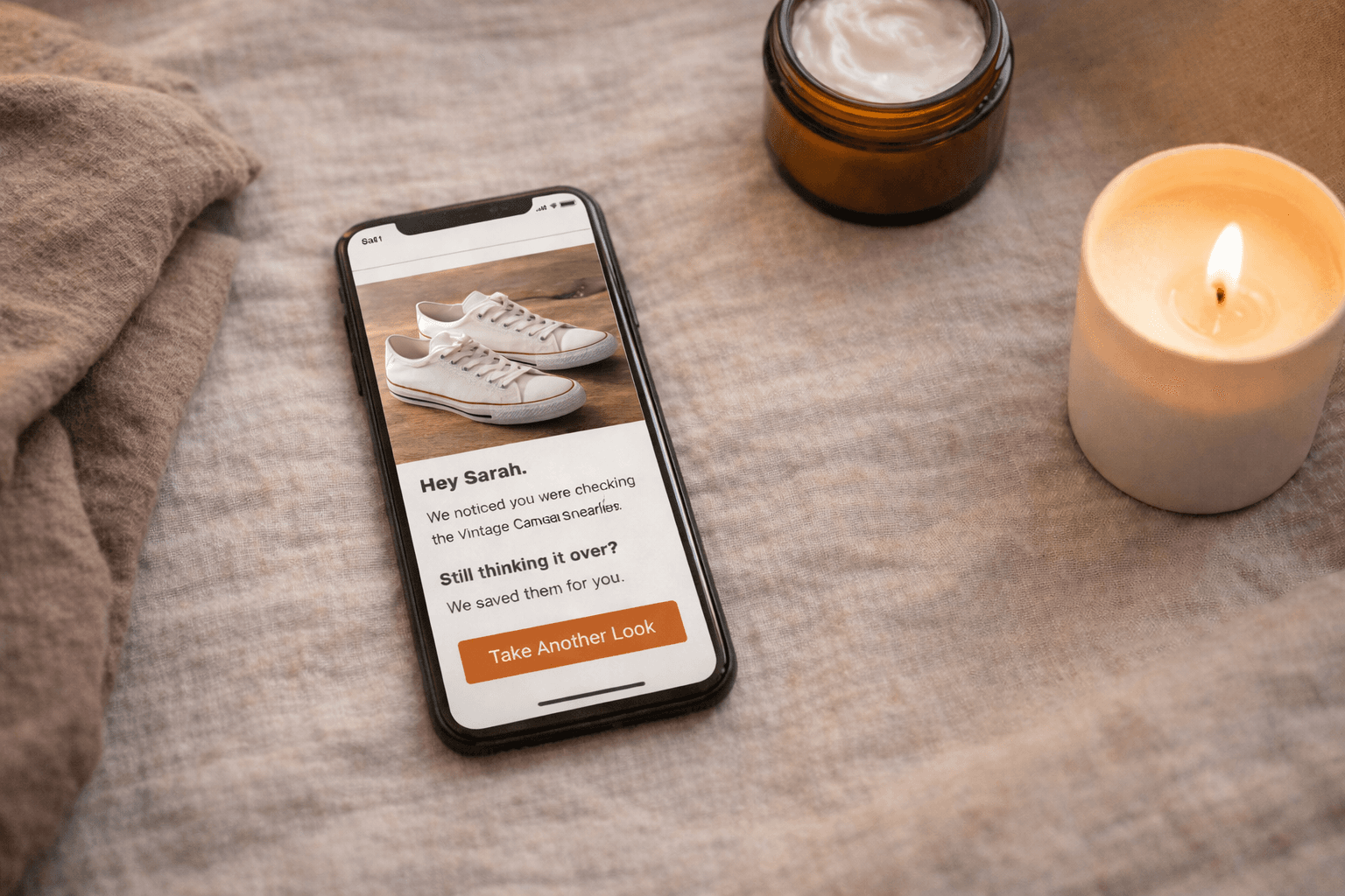
Zone 2: The Hero and Headline
What it is: The browsed product image and the primary headline — the first thing the subscriber reads after the header.
What it should do: Create an immediate visual connection between the email and the product the subscriber was looking at. This is the moment of recognition — "that's the thing I was looking at" — and it should happen within the first second of opening the email. The headline reinforces it with a single line of copy that either names the product, names the benefit, or names the conversation (per the copy frameworks in Part 4).
The product image: This is the most important visual element in the email. It should be:
- High-resolution — 600px wide minimum for desktop rendering
- The same image (or a complementary angle) of the specific product the subscriber viewed — not a generic category image or a lifestyle shot that doesn't show the product clearly
- Prominently sized — taking up 40 to 60 percent of the email width in the hero zone
- Clean background or consistent with your product photography style — the email should feel like a natural extension of your product page, not a different visual system
Dynamic image configuration: As covered in Part 3, the image block should be configured using {{ event.ImageURL }} in a Static content block — not a Dynamic block. Verify the image is rendering at the correct resolution and aspect ratio in both desktop and mobile preview before activating the flow.
The headline: One line. Above or below the product image, depending on your template layout. Should not describe the email — "Here's a reminder about your recent browse" — but address the subscriber directly: "You have good taste" or "Still on your mind?" or simply the product name as a confident standalone statement.
Zone 3: Product Details and Copy
What it is: The product name, price, brief description, and supporting copy — the persuasion layer.
What it should do: Give the subscriber the specific information that moves them from interested to clicking. This is where the Part 4 copy frameworks execute visually — the VOC-informed description, the trust signal, the objection-resolution copy.
Layout principles for this zone:
Product name: Prominent. Larger than body copy. The subscriber who skims without reading should know exactly which product this email is about from the product name alone.
Price: Present and visible. Do not hide the price or remove it in an attempt to avoid "sticker shock." A subscriber who clicks through and sees a price they didn't expect on the product page is more likely to feel deceived than pleasantly surprised. Transparency earns trust.
Description: Short. One to three lines maximum in the product zone. This is a reminder email, not a product page. The full product description lives on the product page — the email's job is to make the subscriber want to go there, not to replicate what they'll find when they arrive.
Trust signal: A star rating with review count, a short review excerpt, or a customer photo sits naturally in this zone for Email 1 and Email 2. It should be visually subordinate to the product information but present enough to be seen during a skim.
The visual weight of copy: Body copy in email should generally be set at 16px minimum — not because subscribers can't read 14px, but because 16px is readable without zooming on mobile, which is how a majority of your subscribers will open this email. Smaller type creates friction. Friction reduces conversion.
Zone 4: The CTA Button
What it is: The call-to-action button. The single most important interactive element in the email.
What it should do: Make it completely obvious what happens when you click it and make clicking it feel easy and appealing.
This is the zone where the most consistent, most preventable design mistakes happen.
Button copy: Never "Shop Now." Rarely "Buy Now" in Browse abandonment Email 1. The subscriber is not ready to buy — they're ready to look again. The CTA copy should reflect that: "Take another look" or "See [product name] again" or "View [product name]."
Jay Schwedelson's data is definitive on this: first-person CTA copy outperforms third-person CTA copy by 20 percent or more in click-through rate. "Show me [product name]" outperforms "View [product name]." Test this against your current CTA language — it is one of the highest-return single-variable tests in browse abandonment optimization.
Button color: High contrast against the email background. Not brand-colored by default — brand-colored by test result. Many DTC brands use a light background with a pastel or muted brand color for their CTA button, and the button effectively disappears. Run the squint test: squint at your email until it blurs slightly. The CTA button should still be the most visually prominent interactive element. If it isn't, the color isn't working.
Button size: On desktop, standard button height (40–48px) is fine. On mobile, where the majority of your browse abandonment emails will be opened, the tap target should be a minimum of 44px tall and full-width or near-full-width. A button that requires precise tapping on a phone screen is a button that doesn't get tapped.
One button, one job: Browse abandonment Email 1 should have one primary CTA button. Not one primary and two secondary. Not a button and then a text link to the same place and a product image that also links. One button. If you want to include a link to related products, make them clearly visually secondary — smaller, text-only links beneath the primary CTA, not competing button-sized elements.
Zone 5: Related Products and Footer
What it is: Secondary product recommendations and the standard email footer — unsubscribe link, address, preference center.
What it should do: Give subscribers who aren't ready to act on the primary product a secondary path — a related product that might be a better fit — without fragmenting attention away from the primary CTA.
Related products layout: Two to three products maximum. Product image and name only — no prices, no copy, no individual CTAs per product at this stage. Keep them visually minimal and clearly secondary to the main product block. A simple row of images with product names beneath is sufficient.
Ben Zettler, a Klaviyo Elite Partner in the top 0.2 percent globally who has served over 300 brands since 2014, emphasizes this hierarchy in template architecture: the related products section should look like a quiet afterthought compared to the main product block. If the related products section has the same visual weight as the hero product, the email becomes a catalog rather than a focused recovery moment.
The footer: Functional and non-intrusive. Must include the unsubscribe link — prominently, not buried in 8px gray type. Making the unsubscribe link hard to find does not prevent unsubscribes. It generates spam complaints, which are substantially more damaging to your sender reputation than an unsubscribe. Make it easy to leave. The subscribers who stay are more valuable than the number who leave.
Mobile-First Is Not Optional
A significant majority of browse abandonment emails — often 60 to 70 percent depending on your audience demographics — are opened on mobile devices. For many DTC brands whose customer acquisition runs primarily through Meta and TikTok, that number is higher.
This means mobile is not a secondary consideration to be addressed in the "responsive design" step after the desktop layout is built. Mobile is the primary canvas. Desktop is the secondary adaptation.
The practical implications:
Single-column layouts only. Multi-column layouts in email — two or three columns of content side by side — collapse unpredictably on mobile. What looks structured and intentional on desktop becomes a stacked mess on a 375px screen. Browse abandonment emails have no design complexity that requires more than a single column. Use one.
Type sizes that don't require zooming. Body copy: 16px minimum. Headlines: 20px minimum. Product names: 18px minimum. These numbers feel large on desktop. They feel correct on mobile. Design for mobile first, then verify it's not excessive on desktop. It won't be.
Full-width CTA buttons on mobile. A button that is 200px wide in the center of a 375px screen has 87px of non-tappable space on either side. A button that is full-width (or 90 percent width) eliminates that friction. Use Klaviyo's mobile-specific styling options to override button width on mobile without affecting desktop.
Product image height on mobile. On mobile, a square or portrait product image will render larger than on desktop and may push the CTA button significantly below the fold. Test your email on at least three phone screen sizes — small (iPhone SE), standard (iPhone 14), and large (iPhone Pro Max) — before activating the flow. The CTA button should be visible without scrolling on standard screen sizes.
Front-loaded copy. On mobile, the reading experience is fundamentally different from desktop. Subscribers are more likely to skim and more likely to abandon if the relevant information isn't immediately visible. Front-load the product name, the key benefit, and the CTA within the first screenful of content. Everything else is secondary.
Dark Mode: The Rendering Problem Most Brands Ignore
Since Apple introduced dark mode across iOS and macOS, a growing proportion of subscribers read email in dark mode by default. Depending on your audience, this can be 30 to 50 percent of opens.
Dark mode rendering in email is inconsistent across email clients. Apple Mail inverts light backgrounds to dark automatically. Gmail has its own dark mode behavior. Outlook on Windows handles it differently again.
The most common browse abandonment design failures in dark mode:
Transparent background product images that show a white product against a now-dark background — making it invisible or nearly so. The fix: use product images with solid white backgrounds (which render with a white box in dark mode) or export images with a transparent background that's been tested specifically in dark mode rendering.
Light gray text on white backgrounds that becomes illegible when the background inverts to near-black. Use sufficiently dark text colors — true black (#000000) or very dark gray (#1a1a1a) for body copy — so that text remains readable after background inversion.
CTA buttons with light text on medium-colored backgrounds that lose contrast when colors shift. Test your CTA button specifically in dark mode preview. Klaviyo's preview tool includes a dark mode toggle — use it.
Will Evans, whose FlowCandy platform and educational content on Klaviyo mastery has helped thousands of DTC brands build better email infrastructure, identifies dark mode testing as one of the most consistently overlooked steps in email QA. The fix is not technically complex. It simply requires testing before sending — which most brands skip when a flow is being activated under time pressure.
Set dark mode testing as a non-negotiable step in your pre-launch checklist from Part 3. Add it alongside the dynamic block verification and the flow filter check. It takes ten minutes and prevents a degraded visual experience for up to half your audience.
HTML vs. Plain Text: Choosing the Right Format by Email Position
Part 4 introduced the plain text email as a copywriting option. Here is the design rationale that completes that case.
Email 1: HTML. The product image is the primary visual trust signal — showing the subscriber the exact product they viewed creates the recognition moment that earns the click. This is the email where design investment is most justified.
Email 2: HTML or plain text, depending on the copy approach. If Email 2 leads with education or social proof, a structured HTML layout supports it. If Email 2 takes a more personal, conversational tone — addressing the hesitation directly as a person rather than a brand — plain text can be the more effective format. Test both.
Email 3: Plain text is worth testing as the default, particularly for the final email in a high-intent browser sequence. The format communicates what no design element can: a person sent this, not a platform. For an email whose job is to feel like a final, genuine note rather than another marketing send, that communication is worth more than a branded template.
Sarah Brereton, former Head of CRM at Gymshark and founder of Level Fifty Three — a Klaviyo-specialist agency working with high-growth D2C brands like Represent Clothing — makes the case for format variety within a sequence on both performance and brand experience grounds. A sequence that uses the same HTML template for every email trains subscribers to recognize and skip it. A sequence that varies — HTML for the product showcase, plain text for the personal close — maintains engagement by refusing to become predictable.
Template Architecture: Building for Scale
Most DTC brands build browse abandonment emails as one-off designs — a template built for a specific campaign or flow, not part of a coherent system.
This works until the catalog grows, the team changes, or the brand refreshes and suddenly every email in every flow needs to be updated manually because nothing was built with inheritance or modularity in mind.
Will Evans's Four Levels of Klaviyo Mastery framework treats template architecture as a maturity indicator. Brands at the early levels build individual templates for individual emails. Brands at the advanced levels build a modular system — a small set of flexible blocks that can be recombined to produce different email types while maintaining visual consistency and technical integrity across the entire program.
For browse abandonment specifically, the scalable template approach means:
One master browse abandonment template with modular blocks that can be turned on or off by segment path:
- Product block (always on — Email 1 and 2)
- Social proof block (on for Email 1 and 2; off for Email 3 plain text)
- Education block (on for Email 2 in first-time buyer path; off for loyal buyer path)
- Related products block (on or off based on sequence position and segment)
- Incentive block (on for Email 3 first-time buyer; off for all other segments)
This modularity means that a change to the product block — a new image style, a layout update, a copy refresh — can be made once and propagated across all email positions and segments that use it, rather than being manually updated in six different email templates.
Andriy Boychuk, founder and CEO of Flowium — a top Klaviyo Elite agency specializing in DTC email and SMS automation — emphasizes that the technical debt created by non-modular email templates is one of the most common operational problems he sees when onboarding new clients. Brands that built flows quickly without architectural thinking spend significant time in maintenance that could be spent in optimization. Build the system once, correctly. It pays compounding dividends.
The Three-Second Test and the Squint Test
Two quick diagnostics that experienced email designers use before signing off on any browse abandonment email:
The Three-Second Test: Show the email to someone who has not seen it before and give them three seconds. Then remove it. Ask: what was that email about? What was the product? What were they supposed to do? If the answers are clear, the visual hierarchy is working. If there is any uncertainty about any of those three things, the design needs revision.
The three-second test catches the most common browse abandonment design failure: an email where the brand and design are the primary visual message and the product is secondary. Subscribers do not spend more than three seconds deciding whether a browse abandonment email is worth their attention. The email needs to communicate its entire value proposition — this is the product you were interested in, here is a reason to look at it again, here is where to click — within that window.
The Squint Test: Squint at your email until the content blurs and only shapes and color masses remain. In this blurred view, three things should stand out clearly: the product image, the headline, and the CTA button. If anything else is visually dominant — a decorative graphic, a navigation bar, a large logo — it is competing for visual priority with the elements that drive conversion.
Use both tests on every browse abandonment email before it goes live. They take thirty seconds and catch problems that hours of detailed design review miss.
Accessibility: The Design Requirement That Is Also the Right Thing to Do
Accessible email design is simultaneously a legal consideration in many markets, a best practice for deliverability, and — most straightforwardly — a design requirement for reaching subscribers who have visual impairments or who use assistive technologies to read their email.
For browse abandonment emails, the accessibility requirements are not complex. They are simply consistently ignored.
Alt text on every image. Every product image in a browse abandonment email should have descriptive alt text — not "image1.jpg" or the Klaviyo default variable name, but a description of what the image shows: "Blue merino wool crewneck sweater, folded, on a white background." This serves subscribers whose images don't load (still a common occurrence on slower connections), subscribers who use screen readers, and email clients that block images by default.
The dynamic product image block should use the product name variable as the default alt text: alt="{{ event.ProductName }}". One configuration. Applied to every browse abandonment email in the flow automatically.
Color contrast for text. The Web Content Accessibility Guidelines (WCAG) standard for readable text is a minimum contrast ratio of 4.5:1 between text and background for normal-sized text. In practice: dark text on light backgrounds, not medium gray on light gray. Klaviyo's email editor does not flag contrast failures — run your color combinations through a contrast checker before finalizing your template.
Semantic structure. Use Klaviyo's heading block types correctly — H1 for the primary headline, H2 for section headings — rather than making everything a large text block. Semantic structure is what allows screen readers to navigate an email correctly, and it also provides a small deliverability benefit through cleaner HTML output.
Design Is a Multiplier, Not a Differentiator
The most useful way to think about browse abandonment email design is as a multiplier on copy quality, not as an independent variable.
Great copy in a broken or confusing layout converts below its potential. Mediocre copy in a beautifully designed template converts at the level of mediocre copy — there is no design that compensates for words that don't do the persuasion work. But great copy in a clean, focused, product-forward layout converts at its ceiling.
Design's job is to remove every obstacle between the subscriber and the click. Every visual decision should be evaluated against that standard. Does this element help the subscriber understand what they're looking at and what to do next? Or does it add visual complexity that must be navigated before they can answer those questions?
The emails that convert best are not always the most beautiful. They are the most legible — in the broadest sense of that word. Legible in their visual hierarchy. Legible in their copy. Legible in their CTA. Legible in their purpose.
Build for legibility. Everything else follows from that.
In the next chapter, we get into one of the most genuinely contested debates in browse abandonment strategy: whether, when, and how to offer a discount — and why getting this decision wrong costs you far more than a few percentage points of margin.
This post is Part 5 of The Ultimate Guide to Browse Abandonment Emails — a multi-part series synthesizing the frameworks, tactics, and philosophies of 25 of the world's top retention email marketing experts, published on Geysera.com.
Read the series:
Part 1: Browse Abandonment Strategy & Philosophy — What It Is and Why It Matters
Part 2: Segmentation & Trigger Architecture — Who Gets This Email, When, and Why
Part 3: Technical Setup — How to Build the Flow in Klaviyo
Part 4: Copywriting — The Words That Turn Window Shoppers Into Buyers
Part 5: Design & UX — The Visual Experience That Gets Clicks (you are here)