Browse Abandonment Email Copywriting: How to Write Emails That Convert Without Feeling Automated
5 expert copy frameworks for browse abandonment emails that actually convert — from VOC research and story structure to subject line tactics backed by 6 billion emails.
The copy is where browse abandonment flows win or lose. Here's how the best retention copywriters in DTC approach it — and the frameworks that make the difference between an email that converts and one that gets ignored.
Part 4 of 7 in the Browse Abandonment Email Series. Previous: Klaviyo Setup ← | Next: Design →
You can have the most technically perfect browse abandonment flow in your Klaviyo account. Proper flow filters. Correct dynamic block configuration. Airtight suppression rules. Four carefully segmented audience paths.
And if the copy is weak, none of it matters.
A subscriber opens your browse abandonment email and makes a decision in under three seconds. Keep reading or close it. That decision is made almost entirely based on the subject line, the first line of copy, and the product image. Everything else — the architecture, the timing, the segmentation — was in service of getting them to that moment. The copy is the moment.
This chapter is about that moment. How to write browse abandonment emails that get opened, read, and acted on — not because they manipulate or pressure, but because they say exactly the right thing to exactly the right person at exactly the right time.
We'll pull from the frameworks of five of the sharpest copywriting minds working in email and DTC today: Joanna Wiebe's voice-of-customer methodology, Chris Orzechowski's story-first approach, Laura Belgray's personality-as-conversion philosophy, Ry Schwartz's psychological state framework, and Jay Schwedelson's data-backed subject line tactics. Each brings something distinct. Together, they form a complete system.
The Fundamental Problem With Most Browse Abandonment Copy
Before getting into frameworks, it's worth naming the thing most browse abandonment copy gets wrong.
It's written about the product instead of for the person.
Open ten browse abandonment emails from ten different DTC brands and the majority will read some version of this:
"You left something behind! [Product name] is still waiting for you. Don't miss out — shop now before it's gone."
That copy is not wrong, exactly. It's just not doing any work. It's occupying space where persuasion should be. It assumes the subscriber just forgot — when the reality is they probably didn't forget at all. They saw the product. They were interested. Something stopped them. And an email that simply restates "the product exists" and adds weak urgency does nothing to address what actually stopped them.
The question that should drive every browse abandonment email you write is this: what was going on in this person's mind when they left?
Not what product did they leave. Not what do we want them to do. What were they thinking and feeling at the moment they closed the tab?
Answer that question correctly, in the right words, and you have the foundation of a browse abandonment email that converts. Answer it wrong — or don't answer it at all — and you have another "you left something behind" email in a subscriber's inbox already full of them.
Joanna Wiebe: Start With the Customer's Words, Not Yours
Joanna Wiebe is the original conversion copywriter. The methodology she built at Copyhackers — and has spent over a decade teaching — starts from a single principle that most copywriters know but few actually practice:
Copy is not written. It's assembled — from the voice of the customer.
What this means in practice: the most persuasive copy you will ever write is copy that sounds like it came from your customer's own head. The words they use to describe the problem the product solves. The specific phrases they reach for when they talk about wanting something they haven't bought yet. The exact language of their hesitation.
You find those words through research. Not by asking yourself what sounds good. Not by consulting a swipe file of "high-converting email templates." By reading what your actual customers say — in reviews, in support tickets, in post-purchase surveys, in social comments — and mining that language for the phrases that do the emotional work.
Wiebe calls this review mining, and it is the most direct path to browse abandonment copy that feels uncannily relevant.
How to Do Review Mining for Browse Abandonment
For each product category you're building browse abandonment copy for, read 50 to 100 customer reviews. Not for sentiment — you already know most reviews are positive. Read them for language.
Specifically, look for:
- The moment of hesitation — reviews that describe what the customer almost didn't buy it, and why: "I was nervous about the sizing because I'm between sizes usually, but…"
- The relief of buying — the transformation language: "I finally found something that actually…"
- The specific language of desire — the words customers use to describe why they wanted it: "I wanted something I could wear to work but still feel like myself"
- The objection they overcame — what they were worried about that turned out not to be a problem: "I was worried it would be too bulky but it fits perfectly"
Those phrases are your copy. Not paraphrased. Not sanitized into brand-voice smoothness. Used as close to verbatim as your context allows — because they are the exact words the next potential customer is thinking when they're looking at the same product.
The practical output of review mining for browse abandonment is two things:
- The primary objection for each product category — the thing most people are uncertain about before buying. This becomes the copy frame for Email 2 in your sequence.
- The transformation language — the words customers use to describe the benefit of owning the product. This becomes the emotional hook in Email 1.
Wiebe's process doesn't end at research. Once you have the language, you organize it into a messaging hierarchy: the most emotionally resonant messages at the top, the supporting proof points below, the features at the bottom. Browse abandonment copy draws from the top — emotion and transformation first, features last or never.
Specificity is the mechanism. Wiebe's rule, stated plainly: vague promises lose sales; specific details earn trust. "You'll love how it fits" is vague. "Eight out of ten customers say they ordered their usual size and it was perfect" is specific. The first sentence asks for trust it hasn't earned. The second gives the subscriber a reason to extend it.
Chris Orzechowski: Story Before Sale
Chris Orzechowski spent 11 years and over $100 million in product sales learning that email copy without story is just noise in a crowded inbox. His framework — drawn from a background as a school teacher before he became one of the most consistently producing ecommerce email copywriters in the industry — is built on a simple truth: humans are wired to follow a story, and a story is the most efficient path to trust.
The implication for browse abandonment: the first email in your sequence should not try to close a sale. It should open a story.
Not a long story. Not a brand manifesto. A micro-story — one to three sentences that create a narrative frame around the product and make the subscriber feel something before you ask them to do anything.
The structure Orzechowski uses for email copy — adapted from classic direct response — maps directly onto browse abandonment:
Hook. Stop the scroll. Create enough curiosity or resonance that the subscriber keeps reading. The hook is usually the subject line and first line of email body, working together.
Teach. Give the subscriber something they didn't have before they opened the email. New information about the product. A perspective on the problem it solves. A customer story that makes the benefit concrete. The "teach" is where trust is built. It's also where the email differentiates itself from every other nudge email in the subscriber's inbox.
Convert. Only after you've earned attention and built a small amount of trust do you ask for action. A single, clear CTA. Not multiple buttons. Not "shop now, browse more, see related products" — one thing.
What this looks like in a browse abandonment email for, say, a DTC supplement brand:
Hook: "Most people who look at [product] three times are wondering the same thing."
Teach: "They want to know if it'll actually work for them — not just for people who already have a perfect routine and eight hours of sleep. Here's what 1,200 customers said after the first two weeks."
Convert: [Product image] [Review excerpt] [Button: "See why it works"]
The email is not long. But it does real work. It acknowledges the subscriber's hesitation directly, offers a teaching moment that builds trust, and only then presents the call to action — which is framed as discovery, not purchase pressure.
This is the structure to internalize for browse abandonment Email 1 and Email 2. You are not closing a transaction. You are teaching someone who is almost ready to buy the one thing that will make them ready.
Laura Belgray: Personality Is a Retention Strategy
Laura Belgray's work at Talking Shrimp is built on a premise that makes a lot of DTC brands uncomfortable: being entertaining is not a luxury — it is the mechanism by which emails get read, remembered, and acted on.
Most browse abandonment emails are forgettable. The product image is the same product image the subscriber saw on your site. The copy is polite and professional. The CTA says "Shop Now." There is nothing in the email that couldn't have come from any other brand selling a similar product.
Belgray's argument — backed by two decades of copy that consistently out-converts more "professional" alternatives — is that voice is what makes an email worth reading. Personality is what makes your brand worth remembering. And an email your subscriber actually enjoys reading is an email that doesn't get unsubscribed from.
Browse abandonment emails are an underrated branding opportunity. They reach your most interested potential customers at a moment of peak engagement with your products. The subscriber just spent time on your site looking at something they wanted. The email that follows is the first proactive communication from your brand after that moment of genuine interest.
That email can be a template. Or it can be a voice.
The practical application of Belgray's philosophy isn't to write jokes or be irreverent for its own sake. It's to ask: does this email sound like a person wrote it? Not just any person — the specific brand voice your company has developed. Warm, direct, a little witty if that's who you are. Or calm and considered if that fits better. The opposite of a template.
The inbox friend test is useful here. Read your browse abandonment email out loud. Does it sound like something a person would say? Or does it sound like something a platform auto-generated?
If it's the latter, rewrite the first line. Then the second. The goal is not a piece of writing that sounds artful — it's a piece of writing that sounds human.
One specific Belgray technique that transfers directly to browse abandonment: the non-sequitur opener. Instead of starting with the product or the nudge, start with a single line that creates curiosity or warmth before the email "gets to the point." It might be a line about the product experience: "There's a reason this one keeps selling out on Thursdays." It might be a voice-led observation: "You have good taste. This is the proof." It might be a question that names the hesitation with humor: "Still thinking about it? Same, honestly."
The opener costs you one sentence and earns you an email that doesn't feel like every other browse abandonment email in the subscriber's inbox. For a flow that sends hundreds of thousands of times a year, that sentence is doing a lot of work.
Ry Schwartz: Write to the Psychological State, Not the Product
Ry Schwartz developed the Coaching the Conversion methodology after a decade of writing launch sequences and evergreen funnels for some of the largest brands in digital — Amy Porterfield, Traffic & Funnels, and dozens of others. His central insight applies precisely to browse abandonment:
Before you write a word of copy, identify what your subscriber is thinking and feeling at the exact moment they receive this email.
Not what you want them to think. Not what would be convenient for them to think. What they are actually thinking — the internal conversation happening in their mind while your email sits in their inbox.
For browse abandonment, Schwartz's framework asks you to map the dominant psychological states of your different subscriber segments. Here are the four most common, and how the copy shifts for each:
Psychological State 1: "I liked it, but I'm not sure it's worth it."
Who this is: First-time buyers looking at a mid-to-high ticket item. They were drawn in by the product. They're being held back by price-to-value uncertainty.
What copy does the work: Value framing. Not discounts — value framing. The job of the email is to close the gap between the price they saw and the value they're not yet sure the product delivers. This can come through specificity about quality and craft, through testimonials that speak to longevity or outcome, through a cost-per-use breakdown for higher-ticket items.
"Most people who buy this use it every day for years. At $X, that works out to less than a cup of coffee a month. Here's what regular customers say about it after 12 months."
Psychological State 2: "I got distracted, and kind of forgot about it."
Who this is: Most browse abandoners, honestly. They were interested. Life happened. The tab closed. The phone rang. They're not in a resistant state — they're just not thinking about it anymore.
What copy does the work: A gentle, warm re-surface with zero pressure. The email that works best for this state is short. It re-shows the product, says something warm and human about it, and provides a single easy path back. No urgency. No "you're missing out." Just: "In case you got pulled away — this is still here."
Laura Belgray's personality principle is most useful here. The email should feel like a friend sending a quick note, not a platform sending a trigger.
Psychological State 3: "I want it, but I'm scared I'm making a mistake."
Who this is: First-time buyers with no prior purchase history with your brand. They want the product but they don't fully trust the brand yet. The hesitation is about risk, not about the product itself.
What copy does the work: Trust signals delivered in a warm, non-defensive tone. Not a list of features. The copy that works in this state names the fear directly — "Buying something you haven't been able to try in person takes a little faith" — and then dissolves it with genuine proof: specific customer outcomes, a clear return policy stated plainly, a satisfaction guarantee that feels real rather than legalistic.
Joanna Wiebe's specificity principle is critical here. "Thousands of happy customers" is not a trust signal. "3,847 customers gave this 4.8 stars, and our most common review says it was better than expected" is.
Psychological State 4: "I'm comparing this to other options."
Who this is: High-consideration category shoppers — apparel, home goods, beauty tools, supplements — where the decision involves comparing multiple brands or products before committing.
What copy does the work: Differentiation. The email should give the subscriber a reason to stop comparing and choose yours — not by disparaging alternatives, but by articulating with precision what makes this product the right answer to the specific problem they have.
Samar Owais, whose lifecycle email work for clients including HubSpot and Pinterest focuses on onboarding and retention, describes this as writing to the "job to be done" — the underlying goal the customer is trying to accomplish. If you can name that goal more precisely than they've named it themselves, and show clearly that your product accomplishes it, comparison shopping becomes less relevant.
"You're not just looking for a face oil. You're looking for one that absorbs fast enough to not push your makeup around. Here's why 2,100 people with the same problem said this one was the one."
Jay Schwedelson: Subject Lines That Actually Get Opened
None of the copy frameworks above matter if the email doesn't get opened. The subject line is the first piece of copy your subscriber sees — and for a substantial portion of your list, it's the only piece of copy that determines whether they engage.
Jay Schwedelson has tested more than 20 million subject lines through SubjectLine.com and sends data from over 6 billion emails annually through Outcome Media. His findings are specific, data-backed, and directly applicable to browse abandonment.
Here's the subject line playbook, organized by impact level.
High-Impact Tactics (20–30% lift in open rates)
Short subject line + blank preheader.
A subject line of three words or fewer, with no preheader text, creates a visual pause in the inbox that is nearly impossible to scroll past. An email preheader is the brief text that you see after the sender information and the subject line when you’re looking at an email in your inbox. The blank preheader doubles down on the intrigue rather than completing the thought.
"Still thinking about it"
"We noticed."
"Just checking in."
Personalization beyond the first name.
Putting the subscriber's area of interest — a product category, a style preference, a known characteristic — in the subject line outperforms first-name personalization consistently. You don't need a merge tag for this if you're segmenting by browse category. Just name the category.
"Your pick from the denim collection"
"Something from the skincare shelf"
"Made for you" framing.
The phrase "made for you" — and variations on it — consistently outperforms standard promotional language. It requires no CRM data beyond the browse event itself.
"Something that might be made for you"
"We pulled this for you specifically."
Fake downplay / reverse psychology.
Schwedelson's 2025 data shows that subject lines that understate urgency or importance are outperforming traditional urgency language. Telling someone something "isn't a big deal" makes them curious enough to open and find out.
"Not a huge deal, but you might want to see this"
"This is probably nothing, but—"
Mid-Impact Tactics (15–20% lift)
"Way to" phrasing.
"Best way to decide on this"
"Fastest way to answer your question about [product]"
"Smartest way to look at this again"
Emojis — specific ones.
Schwedelson's data identifies 👀, ✨, and → as among the highest-performing emojis for browse abandonment context. They signal casual attention without screaming promotion. Use one, in the subject line or preheader — not both.
"Still on your mind? 👀"
Brackets [ ].
Adding a bracketed identifier to the subject line consistently lifts open rates. The bracket signals something specific is enclosed — a category, a type, a clarification.
"[New] What you were looking at"
"[For you] Something from earlier"
What to Avoid in 2026
Schwedelson is direct about the emerging category of subject line language that now actively depresses engagement: AI-generated copy patterns. Words like "unlock," "discover," "optimize," and "transform" have become so strongly associated with automated content that subscribers have developed a reflexive skip response to them. Em dashes in subject lines, which AI tools use in 40 to 60 percent of suggested copy, have the same effect.
The test: if a subscriber can tell the subject line was written by AI, it has already failed its primary job of feeling like a relevant, human message.
Write subject lines the way you would write a text message to someone you know well. Short. Specific. A little casual. Like a real person sent it.
The Preheader: Your Second Subject Line
Every browse abandonment email needs a preheader that works independently of the subject line.
The preheader is visible in most inboxes alongside the subject line before the email is opened. It is effectively a second subject line — and one of the most underused pieces of real estate in email marketing.
For browse abandonment, the preheader has two jobs. If the subject line creates curiosity, the preheader deepens it. If the subject line states the product, the preheader adds the emotional hook.
They should work together, not repeat each other.
Subject: "Still thinking about it?"
Preheader: "Here's the one question most people ask before buying this."
Subject: "We noticed 👀"
Preheader: "You were looking at something good. It's still here."
Subject: "[For you] Something from earlier"
Preheader: "Plus the review that changed most people's minds about it."
What never belongs in the preheader: "If you're having trouble viewing this email, click here." That is 1995. It is invisible to the subscriber and damaging to your open rate. Remove it from every template immediately and never let it back.
Copy by Email Position: What Each Email Actually Says
With the frameworks established, here is how they map onto each email in the browse abandonment sequence. These are not templates — they are structural guides. Your specific product, category, and brand voice determine the actual words.
Email 1: The Warm Reminder
The job of this email: Re-surface the product. Earn enough trust to get a click. Do not close the sale.
Psychological state to write to: Distracted curiosity (State 2 above) for most subscribers; value uncertainty (State 1) for first-time high-ticket browsers.
Structure:
- Subject line: Short, human, low-pressure (use Schwedelson's short + blank preheader tactic)
- Opener: One line that sounds like a person sent it. Warm. Specific to the product or category. No "we noticed you were browsing our website" — that is the email equivalent of a retail associate announcing over the PA that you're looking at something.
- Product block: The browsed product, prominently. Image, name, brief benefit description (not a feature list — one benefit, stated plainly in customer language from your VOC research).
- One trust signal: A short review excerpt, a star rating with the number of reviews, or a single customer photo. Choose the one most likely to address the primary hesitation for that product category.
- CTA: Specific, first-person, product-named. "Take another look at [product name]" outperforms "Shop Now" in click-through. The subscriber knows exactly where they're going and why.
- Related products (optional): 2–3 products from the same category. No copy. Image and name only. Let them browse.
What this email does not include: Urgency language, countdown timers, discount codes, manufactured scarcity. It is a warm knock on the door. Not a megaphone outside the window.
Email 2: The Objection Handler
The job of this email: Address the specific hesitation that kept the subscriber from buying after Email 1. Give them something they didn't have before.
Psychological state to write to: Value uncertainty, trust deficit, or comparison shopping — determined by your VOC research for this product category.
Structure:
- Subject line: Question-based or curiosity-gap based. Name the objection or hint at its resolution.
"The question most people ask before buying this"
"Here's what 847 people said after the first month" - Opener: Name the hesitation. Not accusatorially — with empathy. "Most people who consider this product want to know one thing before they commit."
- Body: Answer the hesitation with specificity. Review excerpt that speaks directly to the concern. A brief product education paragraph — one thing about the product that the product page might not have communicated clearly. An "objection + resolution" structure that borrows from Joanna Wiebe's PAS framework: name the problem, make it real, offer the resolution.
- Product block: Re-show the product. Smaller than in Email 1, but present.
- CTA: Framed as information, not purchase pressure. "See why it works" or "Read the full reviews" often outperforms "Buy now" at this stage.
- Optional: If this is a first-time buyer segment and you're deploying a soft incentive, Email 2 is the place to introduce it — not Email 1. "Because you've been thinking it over — here's something for your first order."
What this email does not include: A rehash of Email 1. If the subscriber didn't convert from the product reminder, showing them the same product reminder again does not produce a different outcome. Email 2 must add something: a new piece of information, a trust signal, a reframing.
Email 3 (First-Time Buyer and High-Intent Segments Only): The Genuine Close
The job of this email: Convert the subscribers who are genuinely close to buying but need one more reason. This is not an email for subscribers who aren't interested — it's for the ones who are.
Psychological state to write to: Decision fatigue or final hesitation. They want to buy. Something small is still in the way.
Structure:
- Subject line: The most human, low-pressure subject line in the sequence. This email should feel like a final, genuine note — not an escalation.
"Last note — and something for thinking it over"
"Still here if you need it" - Opener: Acknowledge that this is the final email in the sequence. That transparency builds trust rather than eroding it. "This is the last time I'll mention this." Subscribers respect the honesty.
- Incentive (if applicable): Genuine, time-bounded, and explained. Not "20% off because we want you to buy" — that framing is transactional and slightly insulting. "We're holding this price for 48 hours because we'd rather you have it than not." The "why" behind the incentive matters. A genuine reason earns the offer far more than a naked discount code.
- Product block: Present. Clean. No clutter.
- CTA: Direct. First-person. Specific. The most explicit CTA in the sequence — this is the email where you are actually trying to close: "Claim your [product name]" or "Lock in your price."
What this email does not include: Fake countdown timers. Manufactured low-stock warnings. Any urgency that isn't real. Chad White, author of four editions of Email Marketing Rules and one of the most rigorous thinkers on email ethics in the industry, makes the case that trust erosion from manufactured urgency is cumulative and real. The subscriber who feels manipulated by a fake "only 2 left!" warning does not forget. They unsubscribe. Or worse, they stay subscribed and stop engaging entirely.
Genuine urgency — an actual limited run, a real time-bound offer, a true low-stock situation — works because it's true. False urgency works once, if at all. And it costs more than it earns.
The Plain Text Option
One of the most effective browse abandonment emails in a sequence is one that doesn't look like an email marketing email at all.
A plain text Email 2 or Email 3 — no product image, no header graphic, no designed template — reads like a direct message from a person at the brand. That pattern interrupt creates open rates and click rates that consistently surprise brands the first time they test it.
The plain text browse abandonment email is not a lazy shortcut. It requires more copywriting skill than an HTML template, because the words are all it has. There are no images to carry visual interest. No brand colors to signal authority. Just sentences that must do the entire persuasion job by themselves.
Laura Belgray's personality principle is most powerful here. A plain text browse abandonment email that sounds genuinely human — that has a voice, a perspective, a warmth — can outperform a beautifully designed HTML sequence in both click-through and conversion.
The format communicates something before the subscriber reads a word: a person sent this, not a platform.
For Email 3 in particular, plain text is worth testing as the default.
The Copy Brief: Working With Writers
If you're briefing a copywriter — in-house, freelance, or agency — on browse abandonment copy, the brief should include:
The segment: Which of the four audience segments is this email for? What is their purchase history?
The psychological state: What is the dominant mental state of this subscriber at the moment they receive this email? (Use the four states above as your framework.)
The primary objection: Based on VOC research for this product category, what is the one thing most likely to have stopped this subscriber from buying?
The proof point: What is the single most compelling piece of evidence that resolves that objection? (A specific review, a stat, a guarantee.)
The brand voice: Two or three reference emails that represent the tone at its best. Not competitors. Your own brand's best past work.
The CTA: What specific action do we want? Where does the button go? What should it say?
What this email must not do: Manufactured urgency? Discount code in Email 1? Generic "you left something behind" language? Be explicit about the guardrails.
A copywriter given this brief can write a better email in one hour than most brands produce through multiple revision rounds without one.
What Great Browse Abandonment Copy Actually Does
Every framework in this chapter — Wiebe's VOC methodology, Orzechowski's story structure, Belgray's voice principle, Schwartz's psychological state mapping, Schwedelson's subject line data — points to the same underlying truth.
The best browse abandonment copy doesn't feel like marketing. It feels like service.
It feels like the brand paid attention to what the subscriber was interested in, thought about what might be stopping them, and reached out with exactly the right piece of information or warmth or proof at exactly the right moment.
That feeling — of being seen, of being understood, of receiving something genuinely useful — is what drives conversion. Not because it manipulates. But because it gives someone who was already close to buying one more reason to close the gap.
Write for that feeling. Every word, in every email, in every segment.
In the next chapter, we move from the words to the visual experience: how to design browse abandonment emails that reinforce the copy's persuasion work — product image hierarchy, CTA button best practices, plain text vs. HTML decisions, and the mobile-first design requirements that most email templates still get wrong.
Related reading:
This post is Part 4 of The Ultimate Guide to Browse Abandonment Emails — a multi-part series synthesizing the frameworks, tactics, and philosophies of 25 of the world's top retention email marketing experts, published on Geysera.com.
Read the complete series:
Part 1: Browse Abandonment Strategy & Philosophy — What It Is and Why It Matters
Part 2: Segmentation & Trigger Architecture — Who Gets This Email, When, and Why
Part 3: Technical Setup — How to Build the Flow in Klaviyo
Part 4: Copywriting — The Words That Turn Window Shoppers Into Buyers (you are here)
Part 5: Design & UX — The Visual Experience That Gets Clicks
Part 6: Discount Debate - When to Offer an Incentive
Part 7: Testing, Analytics & Optimization — How to Improve What's Already Running
Frequently asked questions
What should a browse abandonment email subject line say?
Something specific to the product, not generic. "Still thinking about the [Product Name]?" outperforms "You left something behind" because browse abandoners did not leave something behind — they were looking. The subject line should reflect where they actually are in the decision process: considering, not forgetting.
How long should browse abandonment email copy be?
Short. Under 100 words for the body copy of Email 1. The product image and a single call-to-action do most of the work. Browse abandonment is not the place for storytelling or brand manifestos. The subscriber already saw the product page. Your job is to get them back to it, not to rewrite it in email form.
Should I use the customer's name in browse abandonment emails?
Yes, if you have it. Personalization with first name increases open rates by roughly 20% across email types. But do not fake it. "Hey there" is better than "Hey {first_name}" when the merge tag fails. And name personalization is the floor, not the ceiling — product personalization (showing them the exact item they browsed) matters more.
How do I write browse abandonment copy that does not feel creepy?
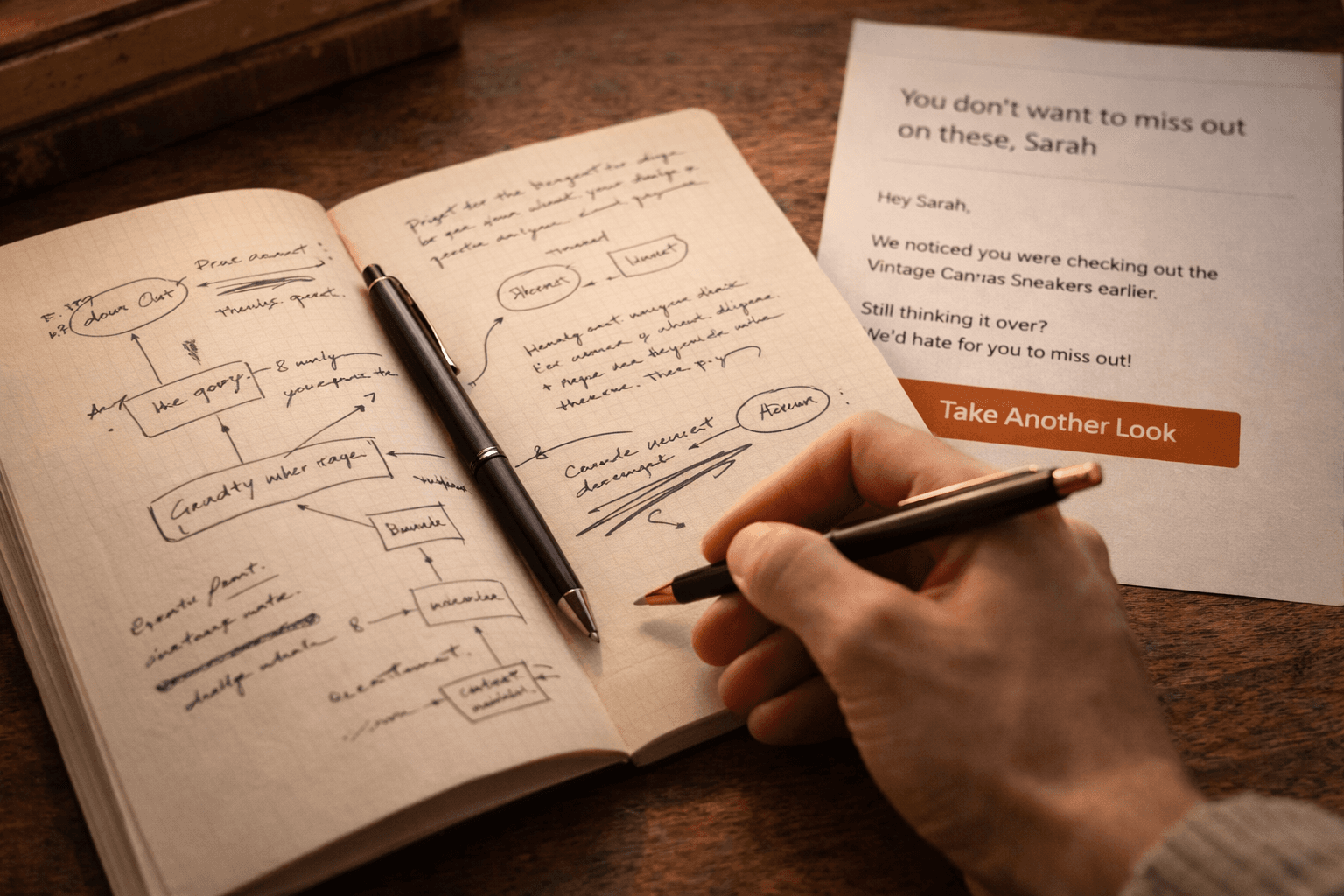
Acknowledge the browse without over-specifying the behavior. "We noticed you checking out the [Product]" is fine. "We saw you spent 3 minutes and 42 seconds on this product page at 11:47pm last night" is not. The line is between helpful reminder and surveillance report. If reading your own email would make you uncomfortable, rewrite it.
What is the biggest copywriting mistake in browse abandonment emails?
Writing about the product instead of for the person. Most browse emails read like a product page recap: features, specs, materials. The subscriber already read that. What they need from the email is a reason to go back and buy, which is almost always emotional (social proof, scarcity, identity) rather than informational.

Co-Founder and CEO
Bob Thordarson is CEO and Co-Founder of Geysera, a serial entrepreneur with 25+ years and five co-founded ventures, including Cequint (acquired by TNS in 2010 for $112.5M) and Consumerware (acquired by ParkerVision). A graduate of the University of Washington and MIT Entrepreneurial Masters Program, based in Seattle, he serves on the boards of DRY Soda Co. and the Entrepreneurs' Organization Seattle chapter. He is an expert in retention marketing email systems and methodology for ecommerce and B2B brands — measured by incremental revenue, not vanity metrics.