Browse Abandonment Email Examples: 10 Real Emails, Pulled Apart
Ten real browse abandonment emails from Cole Haan, Timex, Nomad, Charlotte Stone, Adidas and five other brands, each pulled apart to show the one job it does and the point where it stops working. Includes the subject line five of these brands are running almost word for word, the 2026 open and conversion rates behind the format, and the arithmetic that decides how many of your browse sessions the flow can reach at all.
Key benchmarks at a glance
| Metric | Figures |
|---|---|
| Browse abandonment open rate | 42.16% — Omnisend 2026 report |
| Browse abandonment click-to-conversion | 10.68% — Omnisend 2026 report |
| Browse abandonment conversion rate | 0.59% — Omnisend 2026 report, measured against messages sent |
| Abandoned cart conversion rate | 1.51% — Omnisend 2026 report, the nearest comparison flow |
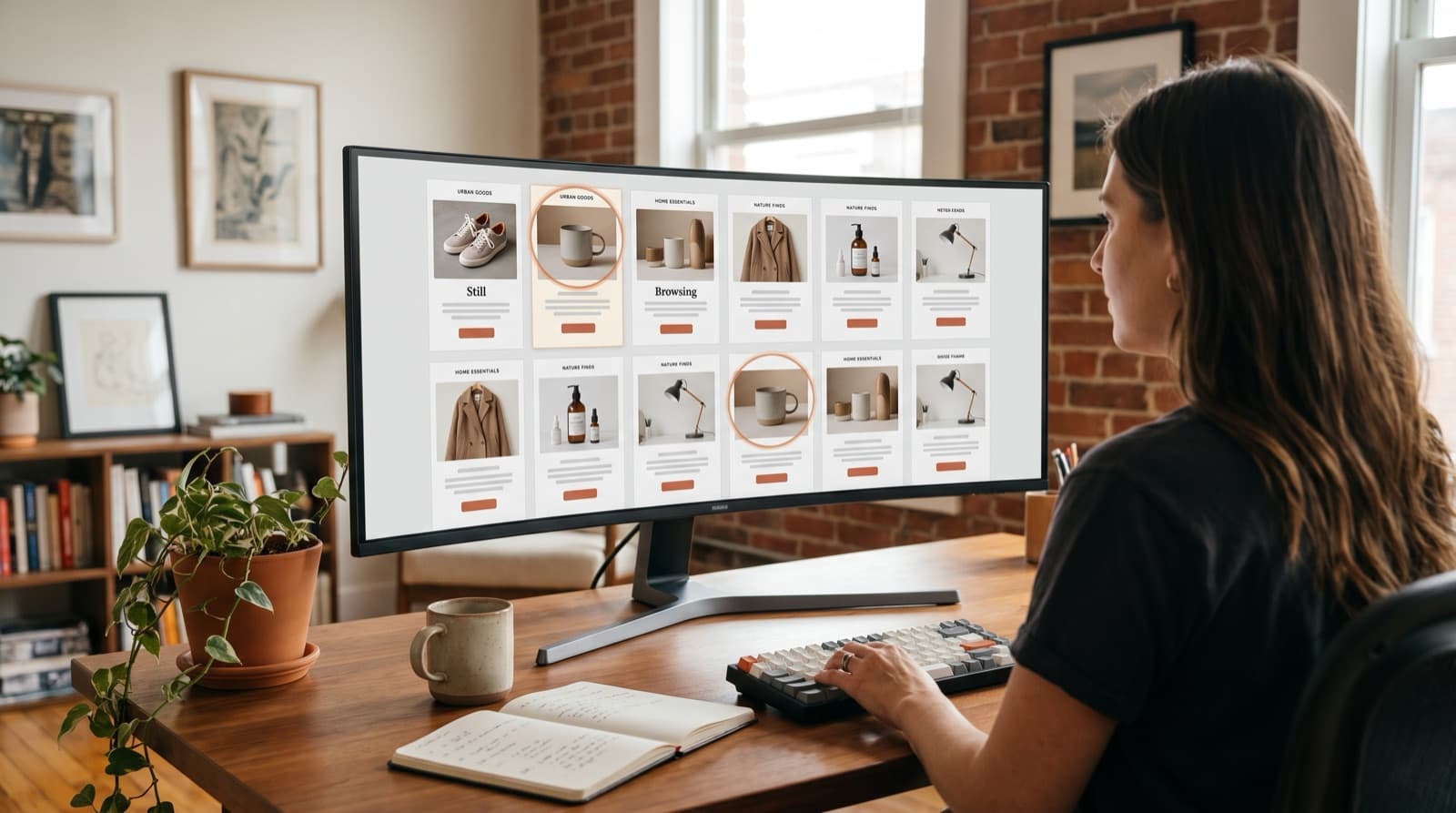
A browse abandonment email is an automated message sent to a known subscriber who viewed a product or category page and left without adding anything to a cart. It fires within hours of the session, shows the item they looked at, and asks them back. Klaviyo puts the conversion rate at 0.96%, 9.6 times the average campaign.
KEY STATS
- Browse abandonment emails convert at 0.96%, against 0.10% for the average email campaign, a 9.6x multiple (Klaviyo)
- Abandoned cart emails convert at 3.55% on the same Klaviyo basis, roughly 3.7 times the browse rate, because cart intent is higher
- Browse abandonment emails posted a 42.16% open rate and a 10.68% click-to-conversion rate in 2026 (Omnisend, 2026 report)
- Measured against messages sent rather than clicks, the same Omnisend report puts browse abandonment conversion at 0.59%, under abandoned cart at 1.51%
- The most-used browse abandonment subject line Klaviyo has measured is "Did you see something you liked?" at a 56.82% open rate, 7% higher than its benchmark average (Klaviyo)
- Two less-copied Klaviyo subject lines outperform it: "We saw you checking us out" opens at 58.55% and "Recommend just for you" at 53.82% (Klaviyo)
- Around 98% of website visitors never identify themselves, which is the ceiling on how many browse sessions any flow can fire on (Twilio Segment, 2026)
- Data compiled from Klaviyo and Omnisend published benchmark figures and from four vendor example roundups, August 2026
I spent an afternoon pulling every browse abandonment email I could find that somebody had published with commentary attached. Klaviyo has five. Omnisend has eleven. GetResponse has eleven more, and Really Good Emails keeps a standing gallery of sixteen. Thirty-odd emails, four sources, and by the third roundup I had stopped reading the copy, because I could predict the next line from the product photograph alone. It never varied much.
Five of those brands open with the same sentence. Not a similar sentence. The same one, conjugated differently, and one of the variants is the most-used browse subject line Klaviyo has on record.
That's worth knowing before you copy anything, and it is simply not what a swipe file is for. So this post does the teardowns properly. Ten emails, what each one is doing, and a fixed line on where it stops working, followed by the part that none of the four roundups mention at all, which is the thing that decides how many people ever receive the email you just spent a week building.
What's in this guide:
- What a browse abandonment email is made of
- 10 browse abandonment email examples, pulled apart
- The examples side by side
- Five versions of one subject line
- What these emails actually do, by the numbers
- The thing no example roundup shows you
- A three-email sequence you can write today
- How to read an example without copying the wrong part
- Frequently asked questions
What a browse abandonment email is made of
Every one of the 10 emails below is built from the same five parts. Klaviyo's own guidance names three of them as non-negotiable: the image and description of the product the shopper viewed, a clear call to action pointing back to that product page, and persuasive messaging carrying social proof, scarcity or urgency.
The five parts, in the order a subscriber meets them:
- The subject line. Usually a question, usually soft, usually about looking rather than buying.
- The recognition moment. A photograph of the exact item they viewed, at the top, large enough to be recognised in the preview pane.
- The reason to come back. A benefit, a review, a stock warning, a policy, or a discount.
- One call to action. A single button pointing at the product page, not at the homepage and not at four categories.
- The fallback. Related products for the shopper who has decided against the first item but hasn't decided against you.
Parts 1 through 4 appear in nearly every published example. Part 5 is where brands diverge, and it turns out to matter more than the creative does.
10 browse abandonment email examples, pulled apart
Each example below is attributed to the vendor or swipe file that published it. The subject lines and copy fragments are theirs; the analysis and the limitation line are ours. None of these brands has published a result for the email in question, so nothing here should be read as a performance claim about a specific send.
1. Charlotte Stone — the compliment
Subject line: "We noticed you noticing us…"
Klaviyo files this one under humour, and the mechanism running underneath the joke is flattery rather than urgency: the copy compliments the recipient on their taste, the call to action returns them to the product page they left, and a row of related recommendations closes the email out.
Where it taps out: flattery works precisely once. It reads as charming in email 1 and faintly unnerving by email 3. Treat it as a send-once idea rather than a house voice.
2. Timex — the plain reminder
Headline: "see something you like?"
Omnisend's example is the format at its most stripped down, and if you only copy one email on this page it should probably be this one: a clean layout, high-quality product photography, obvious Shop Now buttons, and a row of shopping categories underneath. Timex offers no incentive and applies no urgency anywhere in it.
Where it taps out: that category row leaks clicks. A subscriber who taps Men's instead of the product has generated a click your Klaviyo flow report will happily count. What they haven't done is return to the thing they were looking at.
3. Nomad — the reassurance play
Call to action: "seal the deal"
GetResponse's teardown notes that Nomad answers the objection instead of applying pressure, and the execution is unglamorous: the return policy and the two-year warranty sit right next to the product, which addresses the reason a considered purchase stalls rather than the reason a cheap one gets forgotten.
Where it taps out: reassurance only ever works on a hesitation you guessed correctly. For a $19 impulse item, warranty language is noise. Name what the product does instead.
4. American Giant — the plain-text one
GetResponse describes this as plain text carrying a single product and one unmissable Shop Now button, with copy that mostly says a human is available if the shopper has a question about it. No layout. No grid, no graphics, nothing at all that looks designed.
Where it taps out: plain text gives up the recognition moment completely. Without the product photograph, the subscriber's got to read their way back to remembering what they looked at. That's a great deal to ask of somebody who was only browsing.
5. Adidas — the technical excuse
Adidas opens by wondering whether the shopper's connection dropped, adds soft loss aversion with "you don't want to miss out", and closes with reviews of the product that was viewed, which is three separate persuasion moves stacked into an email that reads like an apology. GetResponse takes the subject line as either real concern or a curiosity hook, and notes it works either way.
Where it taps out: the premise is a guess, and it is usually the wrong one. Most people left because they weren't ready. Pretending a browser crashed reads as charming precisely once and condescending on every send after that.
6. Neptune — the education one
Klaviyo's education example leads with a product photograph that demonstrates a benefit rather than merely showing the object, then teaches: the copy names "easy breathability and extreme comfort", walks through the adjustable memory foam and the aromatherapy pouch, and puts a discount code inside the call to action.
Where it taps out: education assumes the shopper left because they didn't understand the product. Sometimes they understood it perfectly and balked at the price. A longer explanation of the memory foam moves absolutely nothing for that person.
7. The Knitting Network — the social proof one
Headline: "Consider this a sign…"
Omnisend's example runs a conversational voice, warns that popular yarns sell out, offers free shipping, and shows thousands of five-star ratings alongside contact details, which makes it simultaneously the most crowded email in this list and, oddly, the most human-sounding one. Nothing in it reads automated.
Where it taps out: four persuasion devices in one email always compete. Free shipping, scarcity, review volume and a support prompt each want the same square inch of a phone screen. A subscriber who skims takes none of them cleanly.
8. Credo — the loyalty-aware one
Subject line: "Get it before it's gone"
Klaviyo's urgency-and-scarcity example is the only one in the whole set that changes depending on who is receiving it, because it opens with free shipping, shows the recipient their current loyalty points balance, and closes with a direct line through to customer service.
Where it taps out: the points balance carries the email, and it only exists for enrolled members. For everybody else the email collapses back into generic urgency. That is the most copied and least differentiated move in this entire category.
9. Girlfriend Collective — the discount one
Subject line: "Take another look + 30% off"
The discount arrives in the subject line itself and the related recommendations are all eligible for the same code, which is a tidy piece of construction. Klaviyo pairs the example with its own warning that percentages and currency symbols in a subject line can push the send toward the spam folder.
Where it taps out: a browse abandoner never added to cart, so you are discounting an intent nobody has confirmed. We argued this at length in the browse abandonment discount debate. The short version: a first-email discount teaches your list to browse and wait.
10. Cole Haan — the category recommendation
Caption: "bag this one before it's gone" · Call to action: "check availability"
GetResponse describes a subtle design that recommends products similar to the one browsed, with a call to action that trades the usual Buy Now for a question about stock, and that smaller ask fits a shopper who's still comparing you against two other tabs.
Where it taps out: check availability only makes sense when availability is truly uncertain. On a product with deep stock it's theatre. The shopper who clicks through and finds 40 in every size has just learned something about you.
The examples side by side
| Brand | The line it leads with | The job it does | Published by |
|---|---|---|---|
| Charlotte Stone | We noticed you noticing us… | Flattery instead of pressure | Klaviyo |
| Timex | see something you like? | Plain reminder, no incentive | Omnisend |
| Nomad | seal the deal | Answers the objection | GetResponse |
| American Giant | (plain text, no headline) | Offers a human to talk to | GetResponse |
| Adidas | you don't want to miss out | Blames the connection, adds FOMO | GetResponse |
| Neptune | easy breathability and extreme comfort | Teaches the product | Klaviyo |
| The Knitting Network | Consider this a sign… | Social proof plus scarcity | Omnisend |
| Credo | Get it before it's gone | Urgency personalised by loyalty tier | Klaviyo |
| Girlfriend Collective | Take another look + 30% off | Buys the click with a discount | Klaviyo |
| Cole Haan | check availability | Lowers the ask to a stock question | GetResponse |
The takeaway: Across ten emails published by Klaviyo, Omnisend and GetResponse, only two do something the other eight cannot copy. Credo personalises on a loyalty points balance and Nomad answers a specific purchase objection. The remaining eight run interchangeable variations on recognition plus a nudge, which is why creative differences between them rarely explain performance differences.
Five versions of one subject line
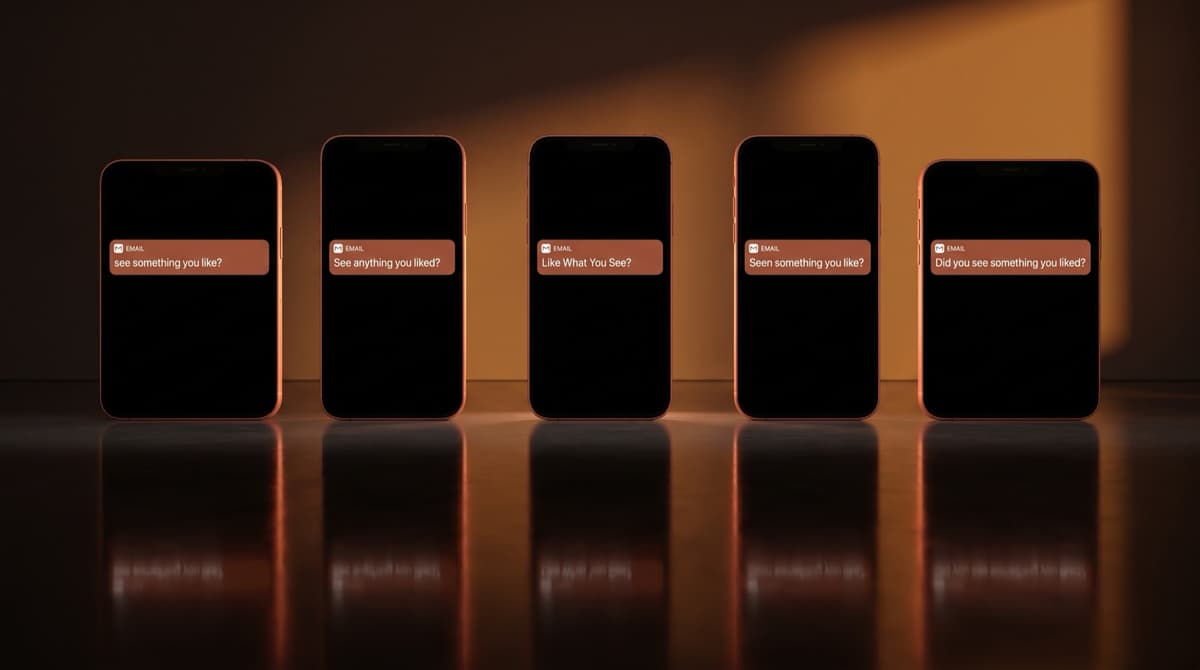
Line the subject lines up and the roundups start to look like one email with ten paint jobs.
| Brand | Subject or headline | Published by |
|---|---|---|
| Timex | see something you like? | Omnisend |
| Alyaka | See anything you liked? | Omnisend |
| Koio | Like What You See? | Omnisend |
| Dusk | Seen something you like? | Omnisend |
| Klaviyo's most-used line | Did you see something you liked? | Klaviyo |
The takeaway: Four separate brands ask the same question, and Klaviyo measures a fifth version of it at a 56.82% open rate, 7% above its benchmark average. The sentence works. It also cannot be your differentiator, because your competitors are sending it too, and two less-copied lines on the same Klaviyo page beat it: 58.55% and 53.82%.
Read the label carefully, because we misread it the first time. Klaviyo calls 56.82% the most popular subject line, meaning the most frequently sent, and popularity is not performance. On the same page, "We saw you checking us out" opens at 58.55%. The most copied line in the category is beaten by a line almost nobody copies, and that is roughly what you would expect once a few hundred thousand senders converge on one safe default.
What these emails actually do, by the numbers
Omnisend's 2026 report puts browse abandonment against the five automations it usually shares a flow library with.
| Email type | Open rate | Click-to-sent | Conversion rate | Click-to-conversion |
|---|---|---|---|---|
| Browse abandonment | 42.16% | 5.49% | 0.59% | 10.68% |
| Product abandonment | 41.48% | 5.45% | 0.74% | 13.65% |
| Cross-sell | 42.09% | 2.93% | 0.75% | 25.50% |
| Abandoned cart | 35.75% | 3.84% | 1.51% | 39.46% |
| Welcome | 33.79% | 3.78% | 2.00% | 52.98% |
| Lapsed purchase | 33.00% | 1.96% | 0.52% | 26.74% |
The takeaway: Browse abandonment posts the highest open rate of the six Omnisend automations at 42.16% and nearly the lowest conversion rate at 0.59%, under half of abandoned cart's 1.51%. It wins attention and loses the sale. The gap is intent, not creative, and no subject line in the previous table closes a 0.92-point spread.
We should correct ourselves here. Part one of this series cites Omnisend at a 34.55% open rate and click-to-conversion above 11%. The 2026 report supersedes both: opens are higher at 42.16% and click-to-conversion is slightly lower at 10.68%. The older pair is still on that page and we'll fix it on the next pass.
One more reconciliation, because two conversion rates on one post invites a fair question. Klaviyo's 0.96% and Omnisend's 0.59% are not in conflict at all. They're different denominators, measured across very different customer bases, and neither vendor publishes enough methodology for anyone outside the company to convert one figure into the other. Treat both as order-of-magnitude. Then measure your own.
The thing no example roundup shows you
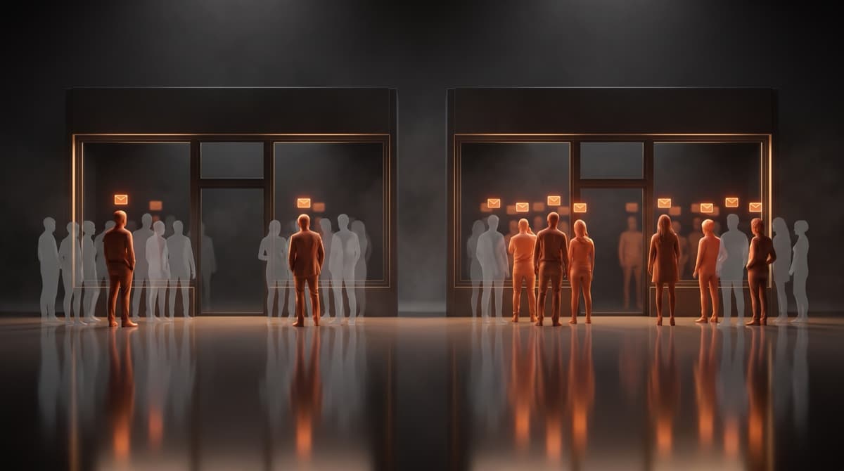
Here is the sentence buried in Omnisend's own definition of the format, and it does more work than any example on this page: a browse abandonment email is sent when a known subscriber views a product and leaves. Known. Every single email above can only ever reach a person whose address you already hold and whose browsing session your platform successfully tied back to their profile.
Twilio Segment puts the anonymous share of website visitors at around 98%. That figure's a floor rather than a ceiling, and it's certainly not the same thing as your own identified rate, but it does set the scale of what is happening on the other side of every screenshot on this page. The flow you build from these examples fires on the sliver of browse sessions Klaviyo or Shopify managed to tie to a profile. Nothing else reaches anybody.
Which makes the arithmetic uncomfortable. Take two stores with the same traffic, the same emails, and different identification.
| Store A | Store B | |
|---|---|---|
| Product-page sessions a month | 60,000 | 60,000 |
| Share tied to a known subscriber | 5% | 15% |
| Browse abandonment emails sent | 3,000 | 9,000 |
| Orders at Omnisend's 0.59% | 18 | 53 |
| Recovered at an $85 average order | $1,530 | $4,505 |
The takeaway: Identical creative, close to three times the revenue. Store B recovers $4,505 against Store A's $1,530 for one reason, which is that 15% of its sessions were attached to a known subscriber rather than 5%. The two identified shares are illustrative and the 0.59% is Omnisend's 2026 published rate, but the shape holds at any traffic level you plug in.
A practitioner who does this for a living put it more plainly than we would.
"For some brands, simply merging duplicate profiles reduced identity gaps by 25-40%, unlocking a ton of browse revenue that was previously invisible." — Alain Garcia, Director of Lifecycle & Creative, Absolute Web (Tie)
Merging duplicate profiles fixes the cheapest version of this problem. The expensive version is the visitor who's never handed over an address at all. There are always far more of those.
This is the part of the market we work in, so read the next paragraph with that in mind. Geysera Signal resolves anonymous sessions against first-party data so a browse event arrives with a person attached, then hands that event to the flow you already run in Klaviyo or Omnisend. It never writes the email and it doesn't replace Klaviyo, Omnisend or Mailchimp. It also won't help a store whose identified share is already high and whose real constraint is average order value, which is a call we have talked people out of. If your browse flow is small because your list is small, a bigger list is the cheaper fix. Go build the popup first.
"I spent an afternoon pulling every browse abandonment example four vendors have published. Thirty-odd emails. Four of them open with the same sentence, give or take a tense, and a fifth version of it is the most-used line in the category. Not one of the four roundups says what share of a store's browse sessions the flow can fire on at all, and that's the number I'd want before I copied a single line of the creative." — Bob Thordarson, Geysera CEO
A three-email sequence you can write today
The examples above are single emails, which is the built-in limitation of every roundup: a flow is three, and Klaviyo's own answer to the question of how many is at least three emails plus one SMS message. Here's the sequence written out, in the register the data supports. This copy is ours, not anybody else's, so take it.
Email 1, four hours after the session. Recognition only.
Subject: Still thinking about the Alder boot?

You were looking at the Alder in walnut. It's still here, in every size.

[See the Alder]

Not the one? These are what people usually look at next.
No discount, no countdown, no scarcity. Four hours sits close enough to the session that the product photograph does very nearly all of the work by itself.
Email 2, one day later. Answer the objection.
Subject: The two questions we get about the Alder

Most people ask us the same two things before they buy the Alder: whether it
runs true to size, and what happens if it doesn't.

It runs a half size large. And returns are free for 60 days, worn or unworn.

[See the Alder]
This is the Nomad move, aimed at one specific hesitation rather than the general one. You may not know what your own two questions are. Your support inbox always does.
Email 3, three days later. Widen, then stop.
Subject: One last look

The Alder's still available. So is everything else in the boot range, which
might be the better fit if you were undecided.

[Browse boots]

We'll stop emailing you about this now.
Three emails and out. Say so in the email, and then do it, because a browse abandoner who feels followed around the internet is a spam complaint waiting for a slow Tuesday. Our post on browse abandonment copywriting goes deeper on the voice; the design post covers what these should look like on a phone.
How to read an example without copying the wrong part
Five things worth checking before any screenshot becomes your template.
- Ask what the brand knows that you don't. Credo's loyalty points balance is the best element in that email and it's unavailable to you unless you run a points program. Copy the structure, not the field.
- Check the intent the tactic was built for. Urgency and countdown timers migrated into browse emails from cart emails, where the shopper had already chosen. Browse abandoners haven't.
- Count the asks. The Knitting Network runs four persuasion devices at once. Most stores would do better with one and a larger product photograph.
- Assume the subject line is taken. Four of the brands here send the same question and Klaviyo measures a fifth version of it. Yours will be the sixth unless you write from your own product.
- Find out how many people it can reach. Pull the number of browse sessions Klaviyo, Omnisend or Mailchimp ties to a known profile. If that number is small, the creative is not your problem.
The second one is the trap most flows fall into, and it is really not a creative failure at all, but a mismatch between a tactic built for somebody standing at the register and an audience that has not picked anything up yet.
"Remember, the browse abandonment segment has the lowest buying intent among your database. Maybe they're still shopping around for the best price, doing some research on the product, or just window shopping for the time being." — Ashley Ismailovski, CRO operations manager, SmartSites (Klaviyo)
Segmentation is how you stop treating that group as one audience, and we've written the segments out elsewhere in this series. If you'd rather start with the mechanics, the Klaviyo setup guide covers triggers, filters and the dynamic product block. And if you're still deciding which abandonment flow to build first, the browse versus cart versus checkout comparison sizes all three.
Frequently asked questions
What is a good browse abandonment email example?
A good one shows the exact product the shopper viewed, gives one reason to return, and points a single button at that product page. Timex's email is the cleanest published version of the format. Klaviyo's guidance names the same three elements as required: the viewed product image and description, a clear call to action, and persuasive messaging such as social proof or scarcity.
What is the best browse abandonment email subject line?
The most-used line Klaviyo has measured is "Did you see something you liked?" at a 56.82% open rate, 7% above its benchmark average. Variations appear at Timex, Alyaka, Koio and Dusk, so it is safe rather than distinctive. Two less-copied lines on the same Klaviyo page beat it: "We saw you checking us out" at 58.55% and "Recommend just for you" at 53.82%.
How many emails should a browse abandonment flow have?
Klaviyo recommends at least three emails and one SMS. A workable shape is recognition at four hours, objection handling at one day, and a wider recommendation at three days, then stop. Omnisend puts the typical flow at one to three emails across one to five days. Longer flows raise complaint risk against an audience whose buying intent was low to begin with.
Do browse abandonment emails actually convert?
They convert less often than cart emails and reach more people. Klaviyo measures browse abandonment at a 0.96% conversion rate against 0.10% for the average campaign, while abandoned cart runs 3.55%. Omnisend's 2026 report, using a different denominator, puts browse at 0.59% and cart at 1.51%. Both vendors agree on the direction.
Can I send browse abandonment emails to anonymous visitors?
Not through a standard flow. Every major platform triggers browse abandonment on a known subscriber, meaning someone whose email address you hold and whose session was tied back to their profile. Twilio Segment reports that around 98% of website visitors never identify themselves, so the size of your identified audience sets the ceiling on this flow before creative matters.
Should a browse abandonment email include a discount?
Usually not in the first email. The shopper never added to cart, so their intent is unconfirmed, and a discount at that stage teaches subscribers to browse and wait. Girlfriend Collective leads with 30% off and Klaviyo pairs that example with a deliverability warning about percentages in subject lines. Hold the incentive for email three, if at all.
Sources
- Klaviyo — 5 browse abandonment email examples and expert tips (Tiff Regaudie) — 0.96% conversion rate, the 9.6x campaign multiple, abandoned cart at 3.55%, the Charlotte Stone, Neptune, Girlfriend Collective, Credo and Sivana examples, and the Ashley Ismailovski quote
- Omnisend — 10+ browse abandonment email examples that convert (Milda Bernatavičiūtė) — the 2026 automation comparison table, 42.16% open rate, 10.68% click-to-conversion, 0.59% conversion rate, and the Timex, Alyaka, Koio, Dusk and Knitting Network examples
- GetResponse — 11 best abandoned browse email examples (Anna Kvasnevska) — the Cole Haan, Adidas, Nomad and American Giant examples
- Tie — Browse abandonment emails: strategy for 2026 — the Alain Garcia quote on identity gaps
- Klaviyo — 20 examples of browse abandonment subject lines — "Did you see something you liked?" at 56.82% as the most popular line, "We saw you checking us out" at 58.55%, "Recommend just for you" at 53.82%
- Twilio Segment — anonymous share of website visitors, around 98%
- Really Good Emails — standing gallery of 16 browse abandonment examples, used to check that the four roundups above were representative

Co-Founder and CEO
Bob Thordarson is CEO and Co-Founder of Geysera, a serial entrepreneur with 25+ years and five co-founded ventures, including Cequint (acquired by TNS in 2010 for $112.5M) and Consumerware (acquired by ParkerVision). A graduate of the University of Washington and MIT Entrepreneurial Masters Program, based in Seattle, he serves on the boards of DRY Soda Co. and the Entrepreneurs' Organization Seattle chapter. He is an expert in retention marketing email systems and methodology for ecommerce and B2B brands — measured by incremental revenue, not vanity metrics.